A couple of month’s ago, I featured the gorgeous home of my friend Anel & today I am delighted to have her back to show off their little AirBnB loft apartment in George, Western Cape – which is adjacent to the main house.
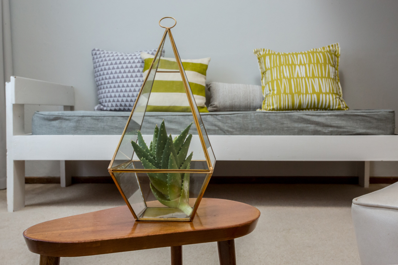
Before & After
Before receiving a facelift, this split level studio was often jokingly referred to as die grot (aka the cave) because it felt a bit cold & dark & not so welcoming. But now the space has the exact opposite of a cave feel.
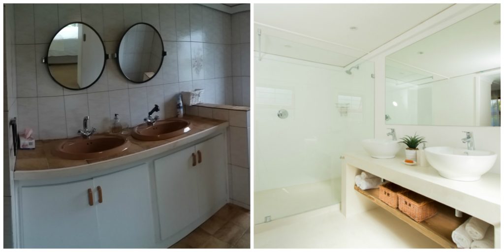
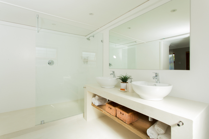
The old bathroom was the biggest eyesore but has turned into a gorgeous minimalist sanctuary.
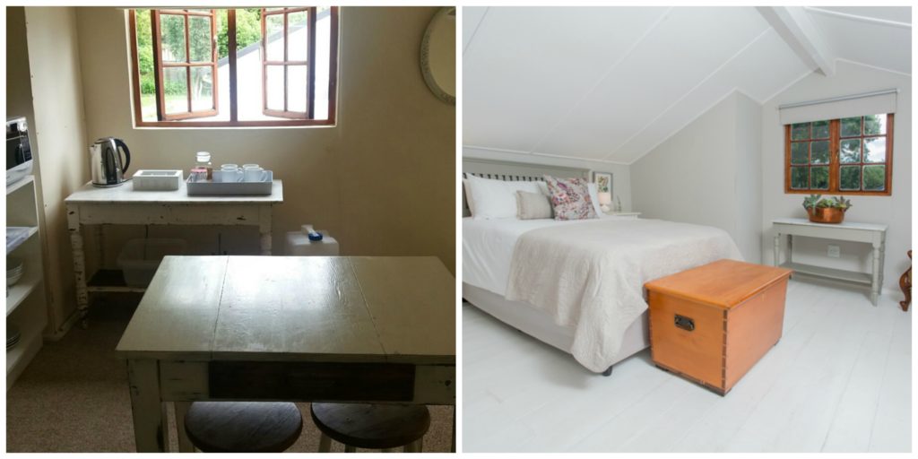
Another huge improvement is that the original makeshift sleep & kitchen areas traded places. The new setting makes much more sense with the lounge, dining & kitchenette areas downstairs.
Until December 2015 she used the space as an art studio, but then realised that it might have potential as holiday accommodation. And wow, it became extremely popular. Anel felt all along that it needed a bit of TLC & wanted to offer guests a lovely place & so things led to the renovation in October 2016.
The inspiration
“The mezzanine level was already there & it lent itself towards a sleeping space upstairs rather than downstairs. We lived in a Victorian loft conversion in London & we realised that with clever planning we could do a lot more with the space,” says Anel.
Anel was after a Scandinavian style for the revamped loft as you can see on her Pinterest/mood board. Light walls, minimalism & light wooden or white furniture with a touch of modern design to it. She had to work with what she already had & the result is cleverly combined heirloom antiques with quirky thrift shop finds, retro furniture & original modern art.
“We only ended up buying two (plastic) chairs with a modern clean look,” she says. The clever use of white paint on select furniture pieces, the wooden floor & staircase, plus the sheer curtains, all contribute to the calm, minimalist feel.
The result
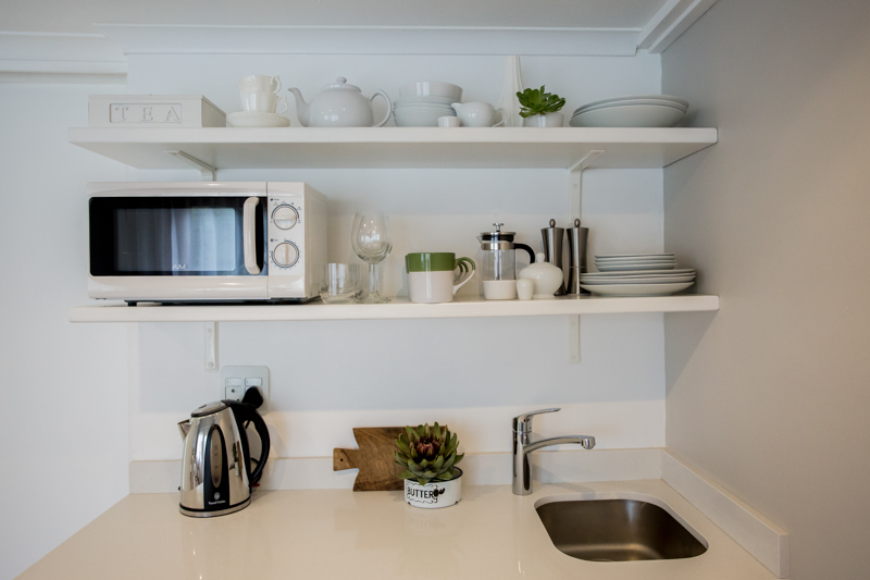
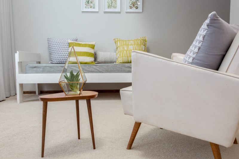
“These lines are echoed by the square design of the armchair. A complementing contrast is the rounded shape of the rocking chair with the tiny shaped side table with its teardrop shape & tapered legs.” Anel loves the little side table & reckons that it has massive attitude!
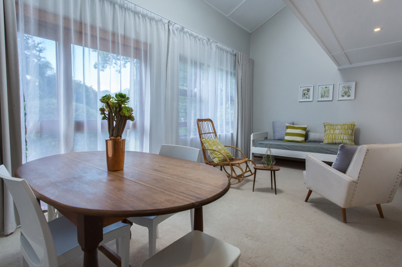
She added vintage botanical prints in simple frames to marry the colonial style furniture with the modern elements. Fresh green scatters bring the garden inside. The large abstract artwork – made by Anel herself, but sadly doesn’t come to its right in the image below – adds texture & subtle hues of copper.
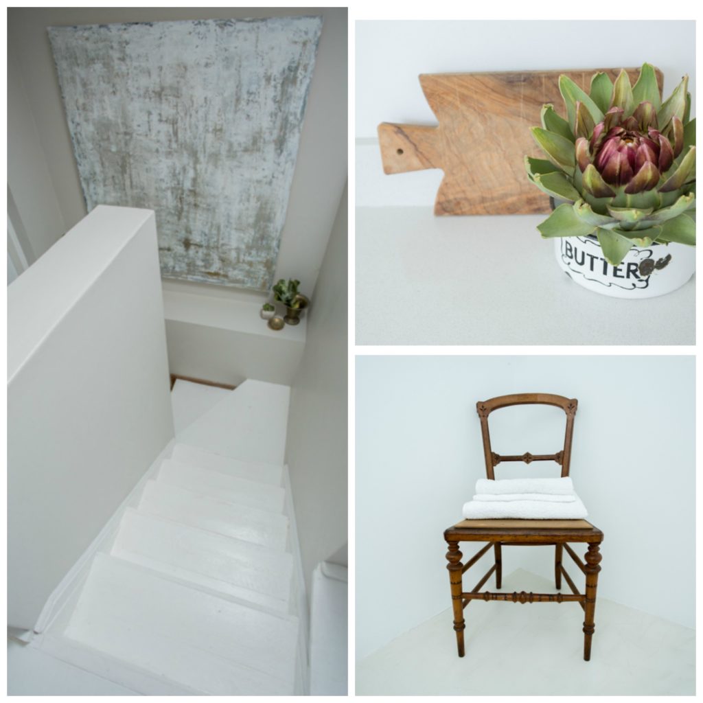
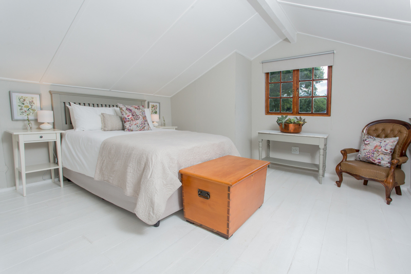
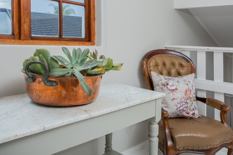
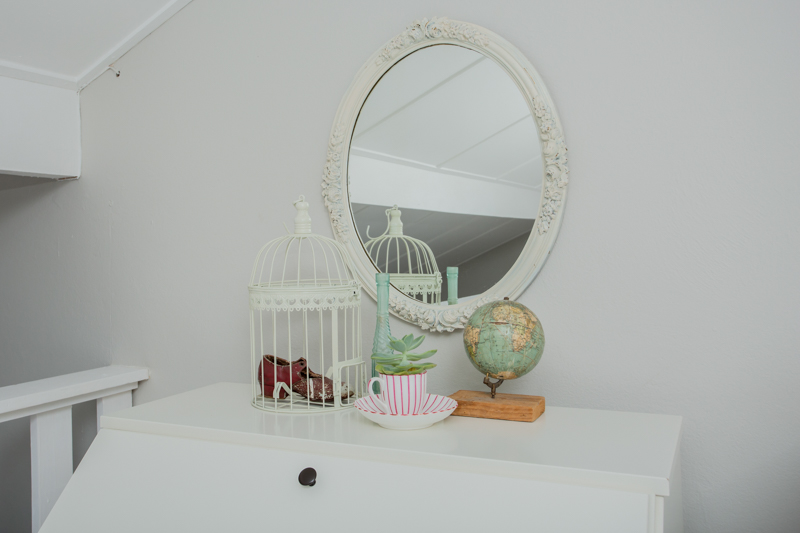
“Similar tones & more greenery is repeated upstairs to tie the look together,” adds Anel. The peacock cushions (by Hertex ), add some glamour & matches the ostrich leather arm chair.
“We wanted a seamless look in the bathroom, so we opted only to paint the walls [instead of tiling]. I really love the elegant space that does not compete with the rest of the décor.”
Anel, once again thank you so much for inviting us into your space.
When you’re next in George, make sure you book a stay over at Anel’s gorgeous loft well in advance. (You will also notice from the reviews why she is indeed a super duper host.)
Thank you for reading.
Yolandi ♥
All images: Melanie Maré Photography for aZestyLife.
