
2020 has made so many of us rethink our living spaces, right? Some moved because their home space is not ideal for all the working (out), playing, cooking & teaching that has to be done from home these days. Downscaling, upsizing, semigrating, immigrating & redecorating has become very common.
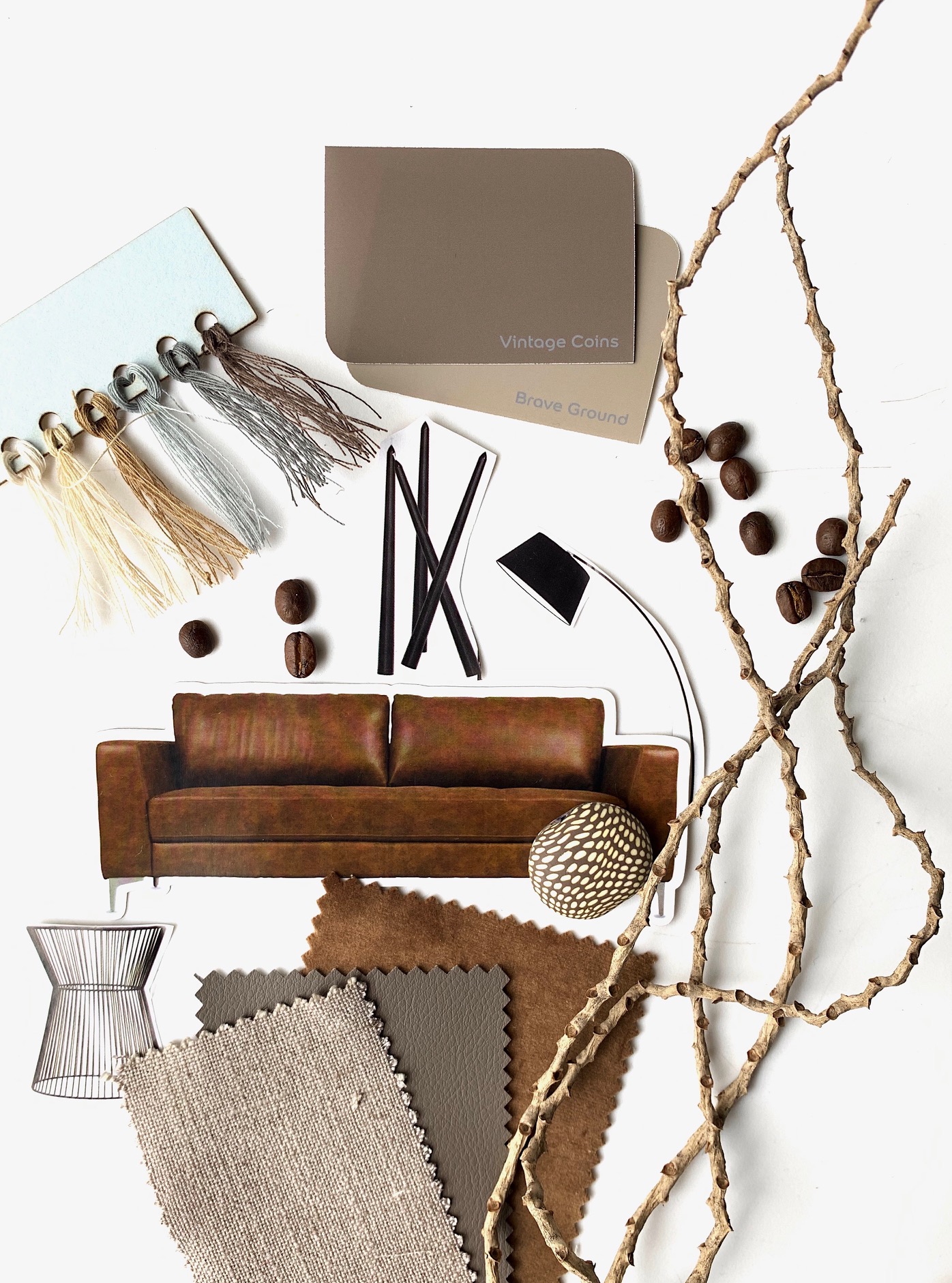
Today & going forward, we all have to be much more intentional about creating the right kind of atmosphere in our homes. So, when Dulux recently announced their Colour of the Year for 2021 as ‘Brave Ground’, it just felt right.
Every year, global colour & design experts come together to decide what the colour of the following year will be. Understandably, 2020 has been a really challenging year to transform the key global trends into inspiring colour palettes, explains Heleen van Gent, Creative Director of AkzoNobel’s Global Aesthetic Center. “We’ve seen unprecedented global change, with all of us facing experiences that feel out of kilter with the modern world. At the same time, we’ve rediscovered more positive things: solidarity in communities, strangers’ generosity & the realisation that together we can do extraordinary things. We’re finding the courage to pick ourselves up & move forward. Our homes provide a sanctuary: a place to restore, repair & recalibrate ourselves on the road to recovery.”
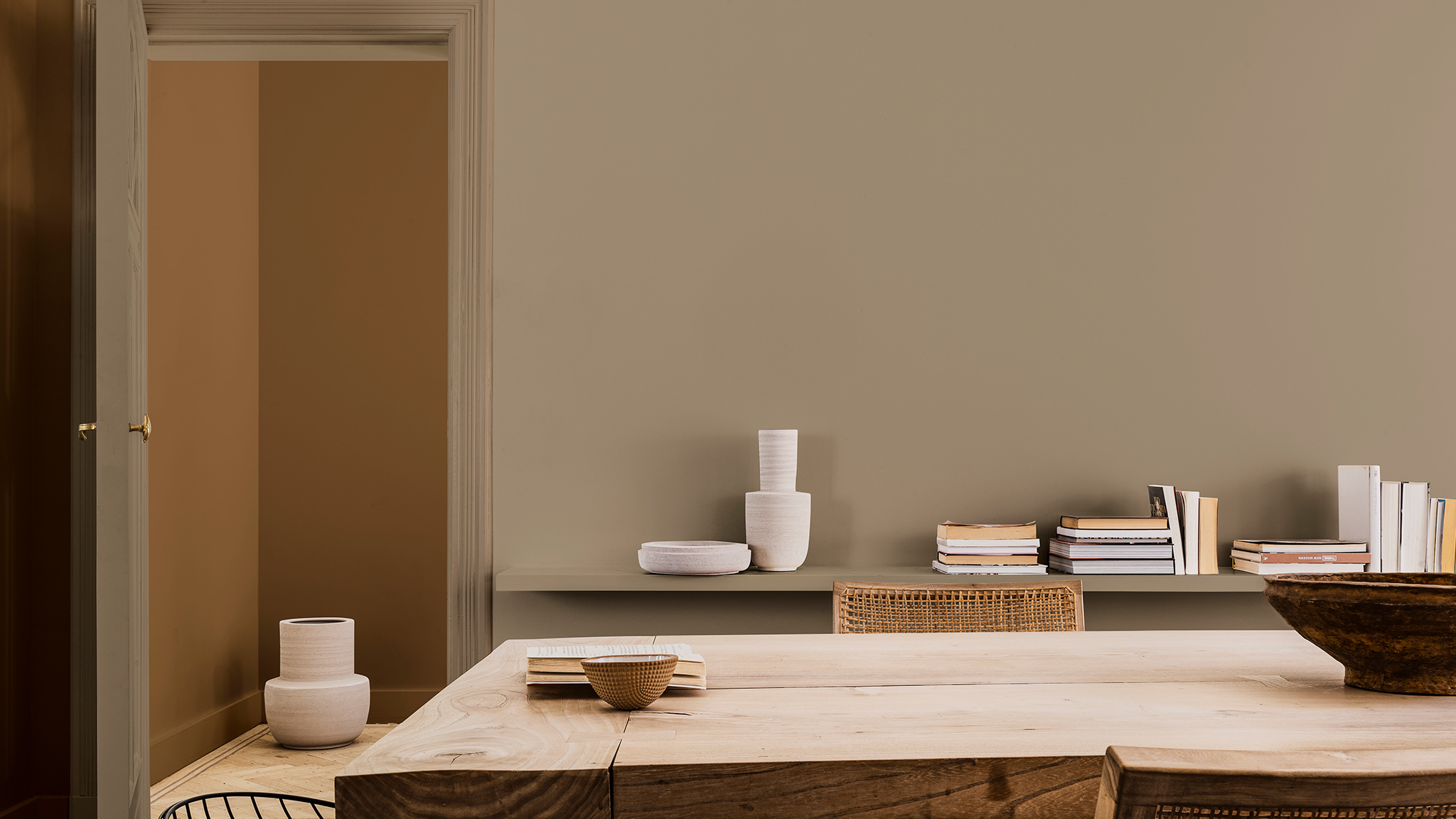
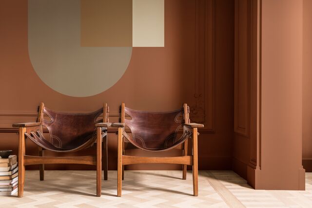
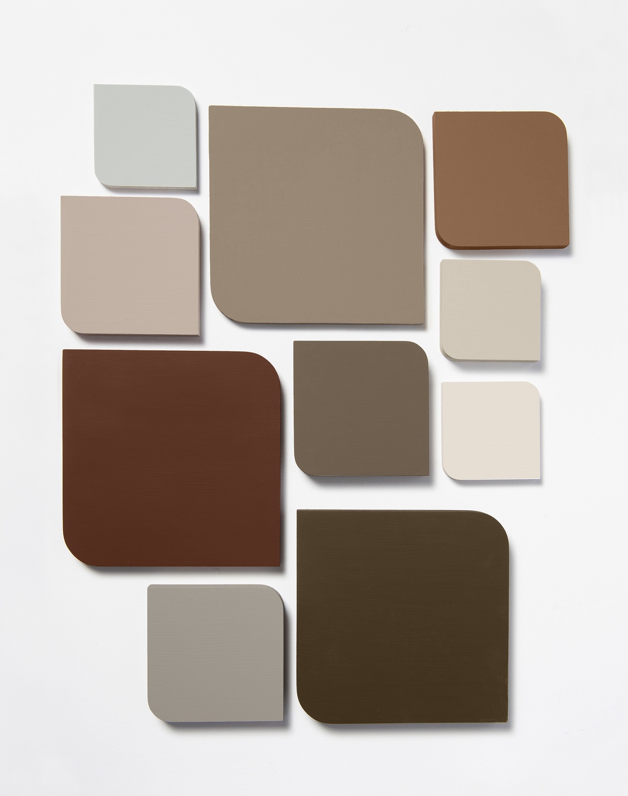
The theme for 2021 is having the courage to embrace change. Brave Ground – a warm, natural tone provides a strong base for embracing change. It is the hue that links us back to nature & the simpler things in life. On its own, it is a powerful neutral, but Brave Ground can also be used in a way that allows other colours to shine.
Four Colour Palettes
Brave Ground can be used with its complementary palettes & techniques to bring balance, stability & courage into our surroundings. The four colour palettes built on Brave Ground take this neutral shade in very different directions. Each palette allows you to express yourself in a unique & personal way:
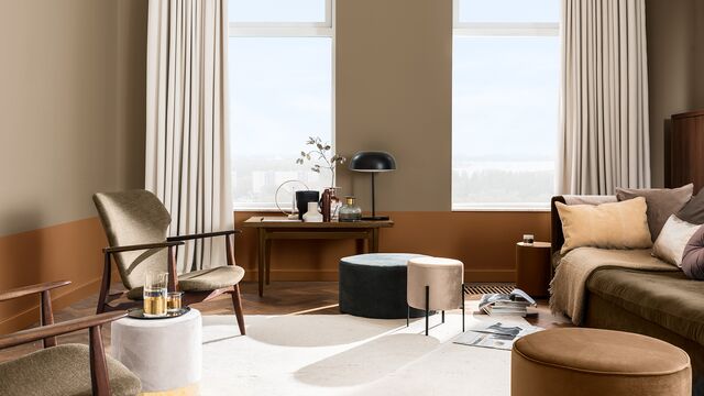
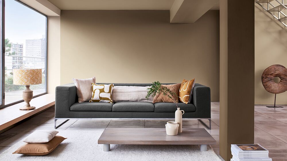
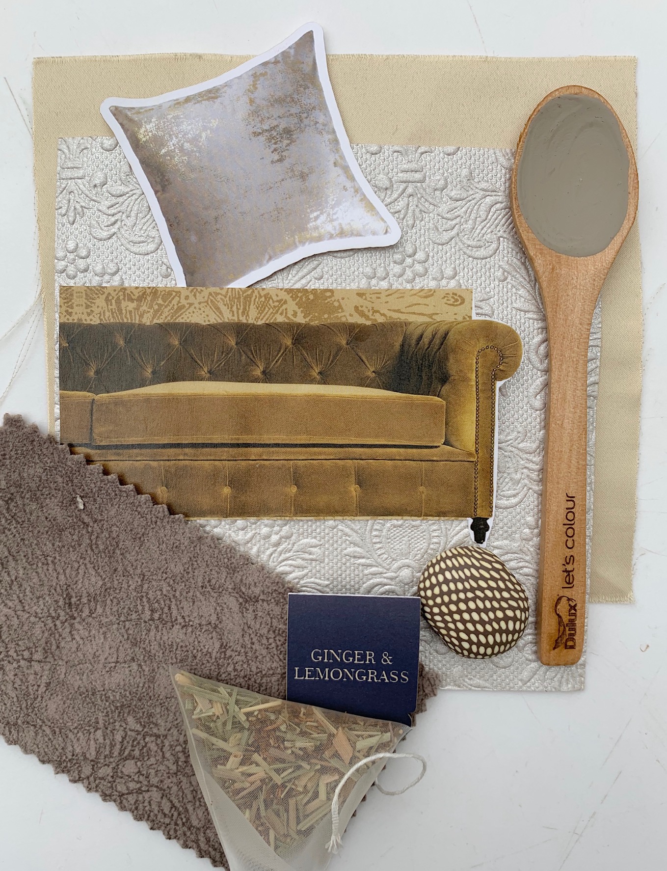
The Trust Colour Palette brings together earth tones from across the globe to encourage collaboration & a sense of community – offering reassurance in connection.
This palette is all about connection (something that we’ve all be starved of in 2020), communication, solidarity & gathering together. I really love these earthy, modern shades of grey & brown.
These colours work brilliantly with wood, copper, ceramics. Warm trust colours bring unity to a living space creating somewhere where people can feel connected.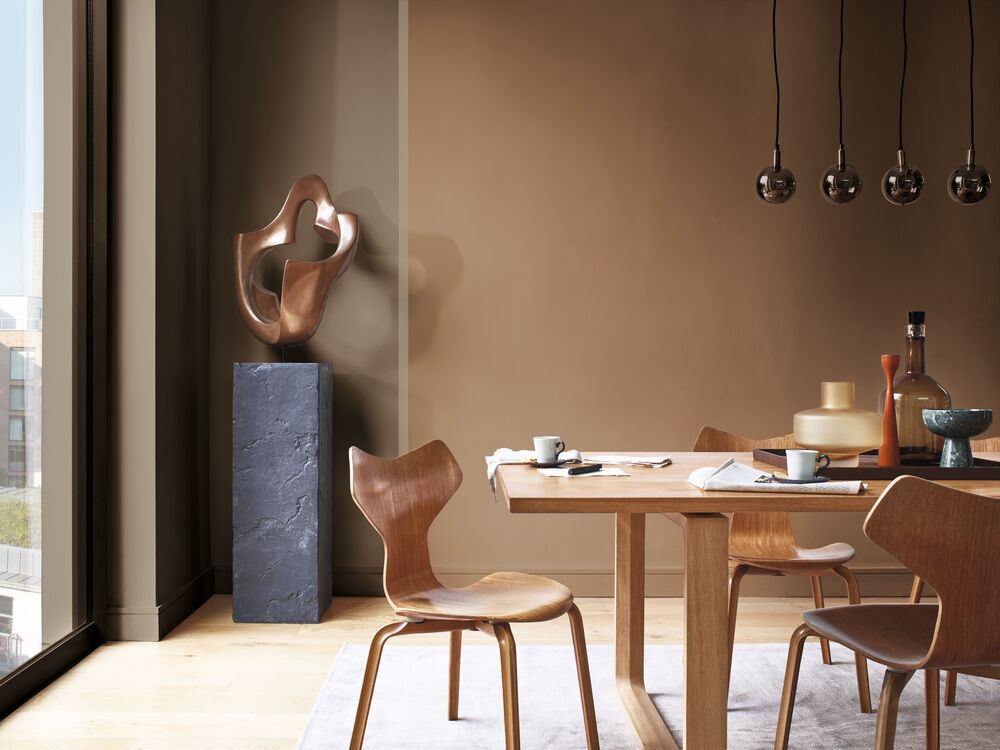
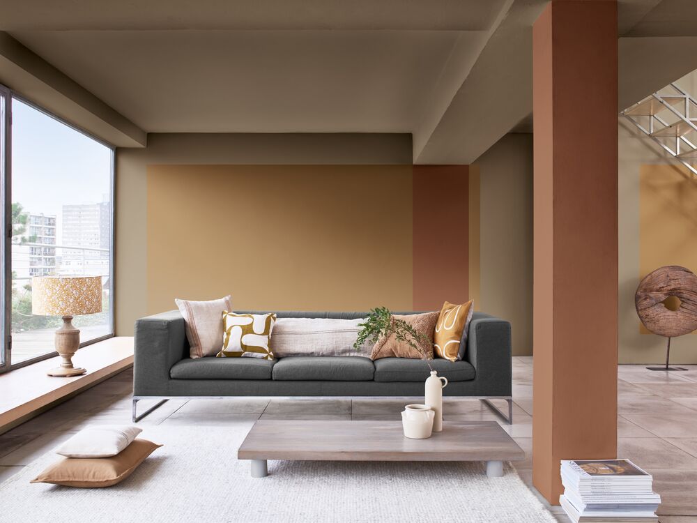
The Expressive Colour Palette stands out with shades of reds & pinks that are balanced by soft neutrals – granting the courage to be yourself. I love this palette for kitchens & bathrooms.
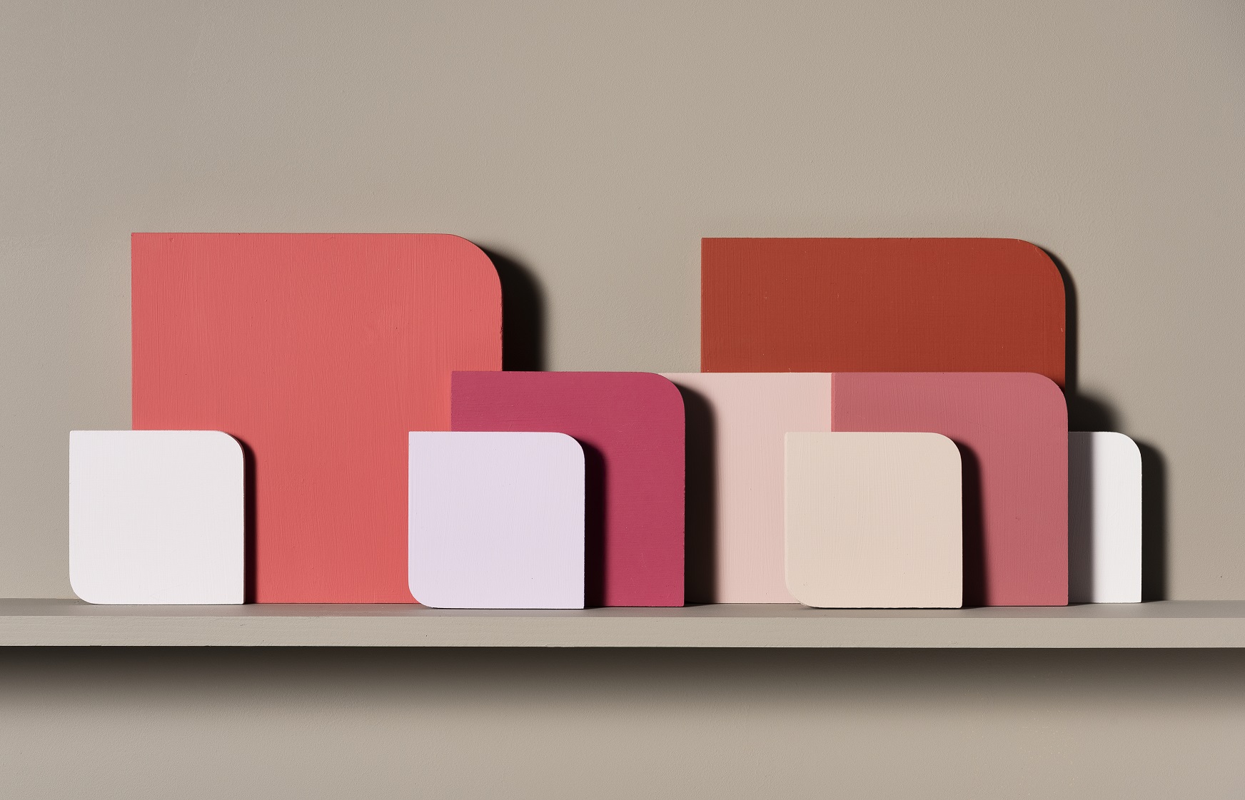
This expressive colour palette is put together to give you the courage to speak up, to be creativity & to express your individuality. These expressive colours also create spaces for authenticity, positivity, generosity. It empowers you to be yourself. Adding these colours to a hospitality space will make it more memorable by adding zest & vitality.
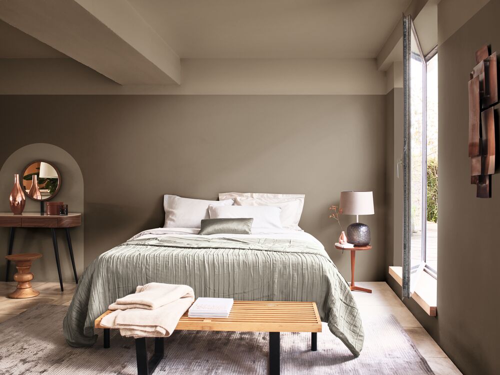
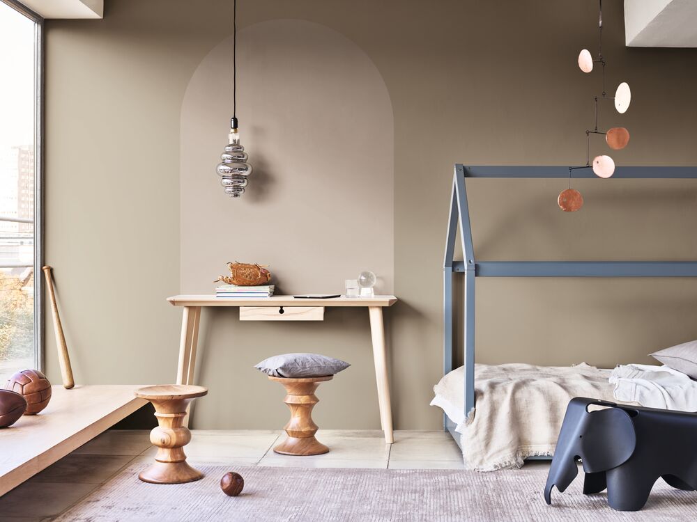
The Timeless Colour Palette gives us the courage to build up the past for a bright future. The old & the new come together here with yellows, ochres & soft neutrals. In the home, I would use this colour palette for a more formal lounge.
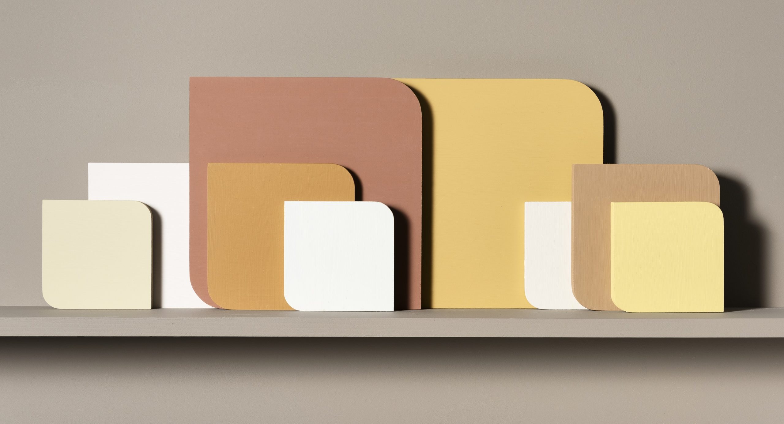
Use this palette to create spaces for balance, cultural heritage, as well as future treasures. You can also use these hues to highlight architectural features like window frames & panelling.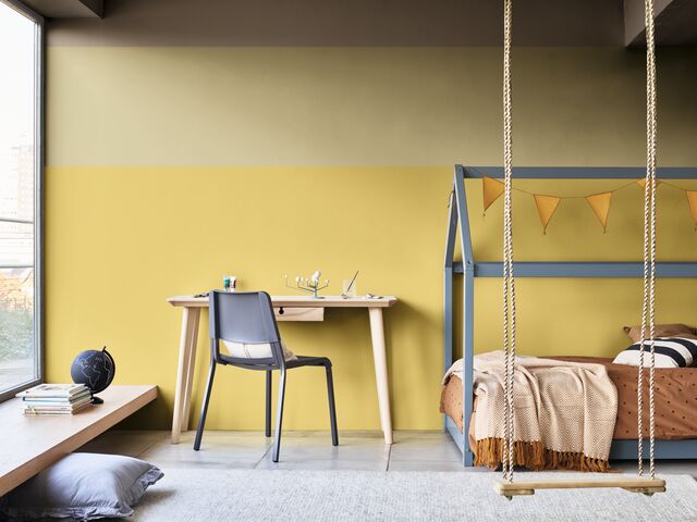
The yellows are not overpowering, making it ideal for educational spaces. It encourages fresh thinking. The old & new of the timeless palette create a balanced & open backdrop for public areas.
The Earth Colour Palette connects us to the natural world with blue, green & brown. It echoes the sea, the sky & the soil – giving us the courage to adapt. This palette is my absolute favourite & has me daydreaming about decorating an entire beach house.
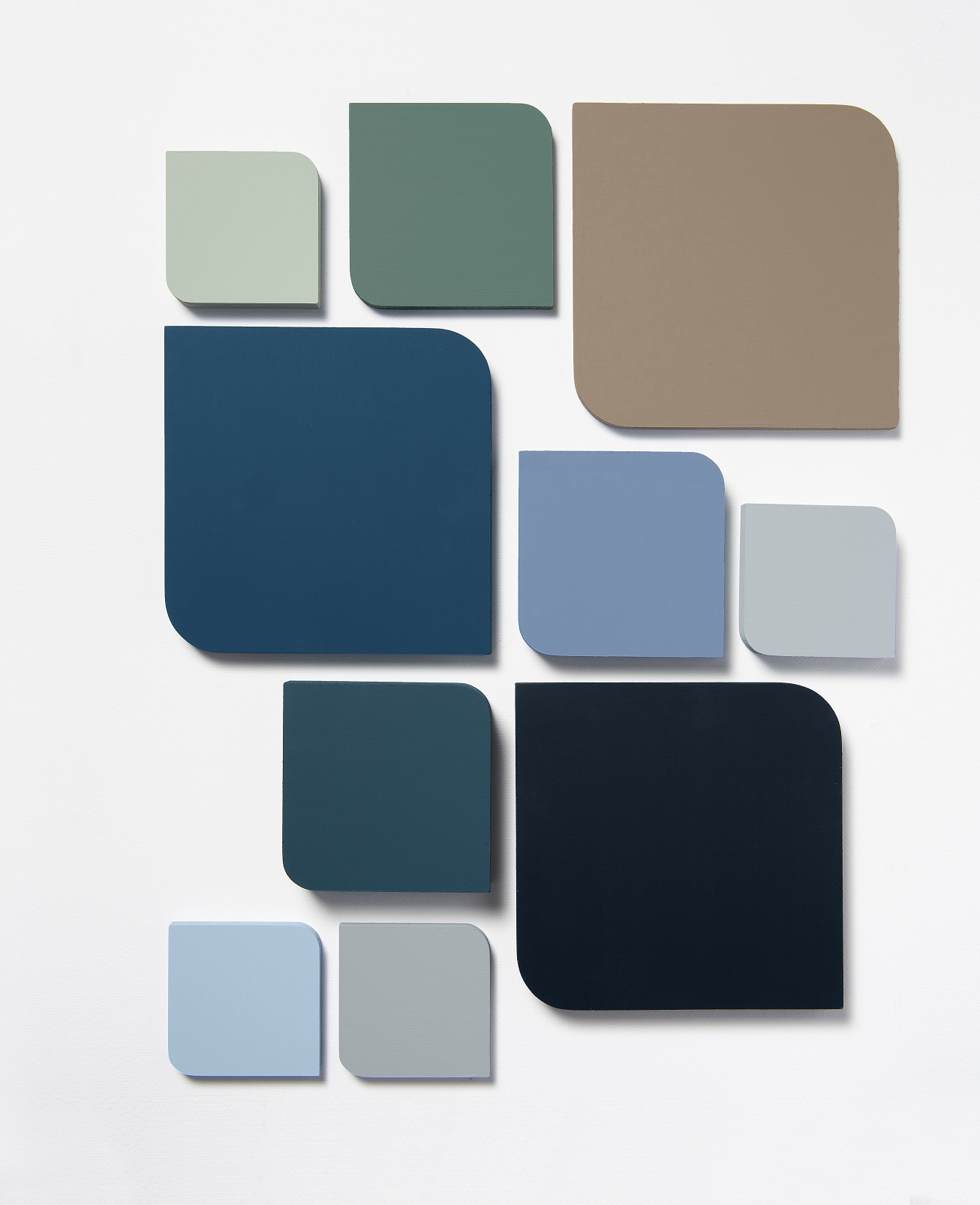
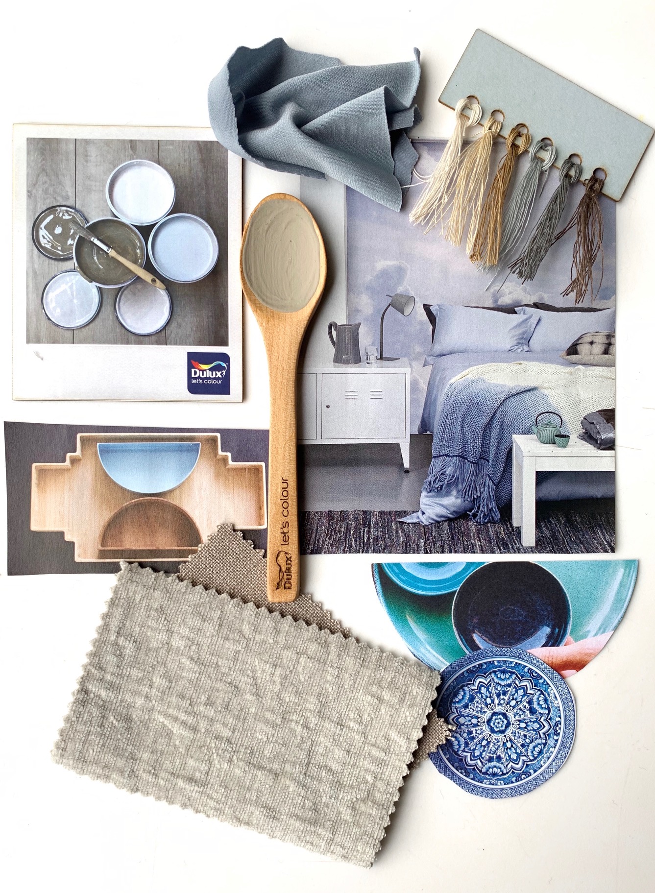
Earth colors create a springboard for you to forge a brave new world. This palette is about creating space for simplicity, responsibility & legacy. It can be used in healthcare spaces as it boosts wellbeing, helping patients & visitors to destress. Earth colours will make you feel more in touch with the outside world, which is why it works so well in coastal homes & rooms too.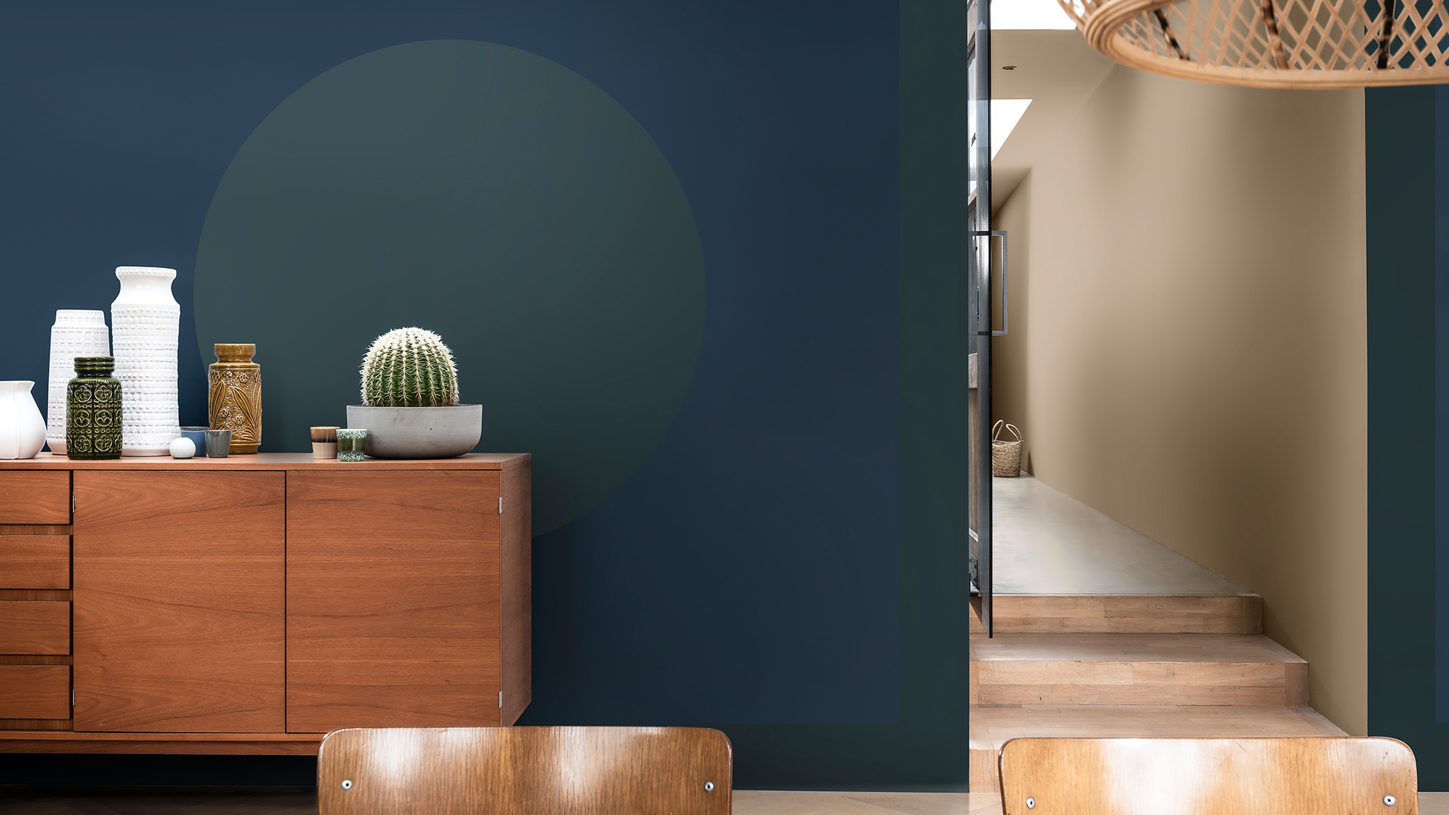
I hope these beautiful colours have inspired to make your home more of a haven.
Which palette is your favourite? I’d love to hear from you.
Yolandi ♥
Images: Supplied & my own
Ps. Do you still remember the gorgeous Crème Brulee from 2019 or 2018’s Pictured Rocks?