
 I really enjoy this time of year as we get ready for end-of-year things including all the forecasts, trends & announcements for the year to come.
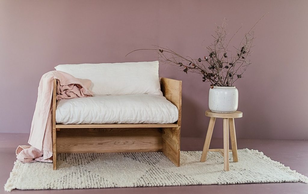
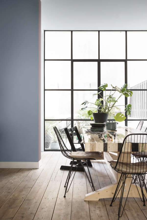
So today I’m delighted to share with you, the Dulux Colour of the Year for 2018 that was recently announced. It is called “Pictured Rocks” & is really gorgeous. Take a look at this clip.
In store & internationally Pictured Rocks is known as Nordic Sails 2.
 The manufacturers of Dulux, AkzoNobel, invest in ongoing research into trends, insights & consumer behaviour. These insights are then used to come up with the trends for the year ahead.
Right now, consumers want to (& need to) create homes where they can recharge, find protection, solace & ultimate relaxation away from the outside world & the elements.
Our lives have become so dependant on technology & people often feel extremely isolated despite living in the most connected era ever. With Pictured Rocks, Dulux envisages that people will create a sanctuary from the world outside where they can reconnect with themselves, loved ones & friends.
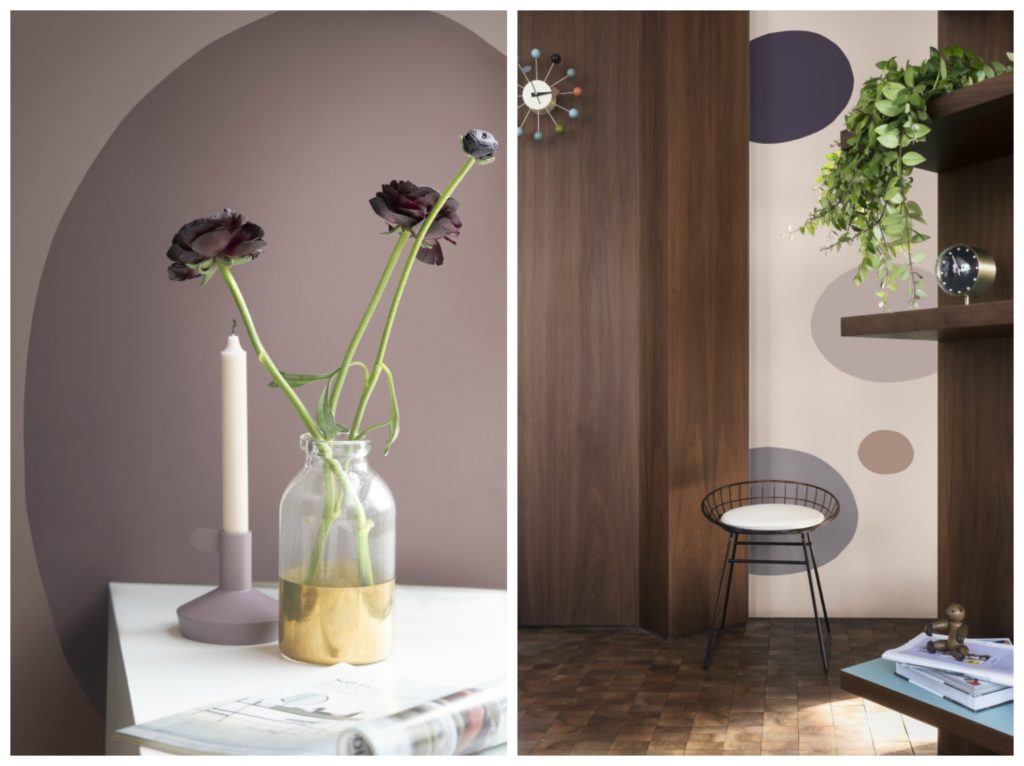
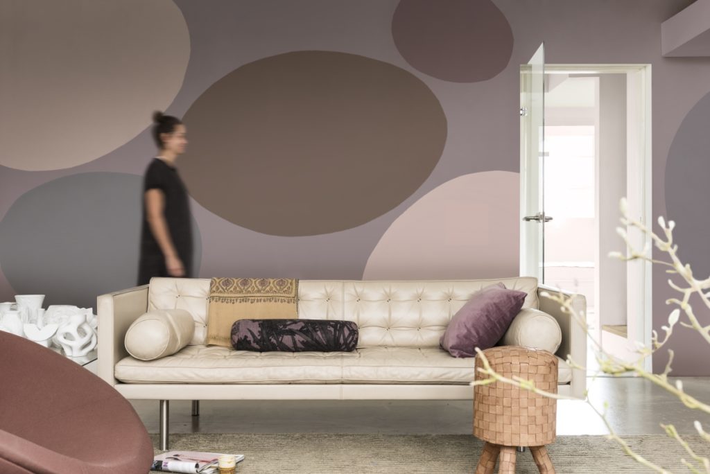
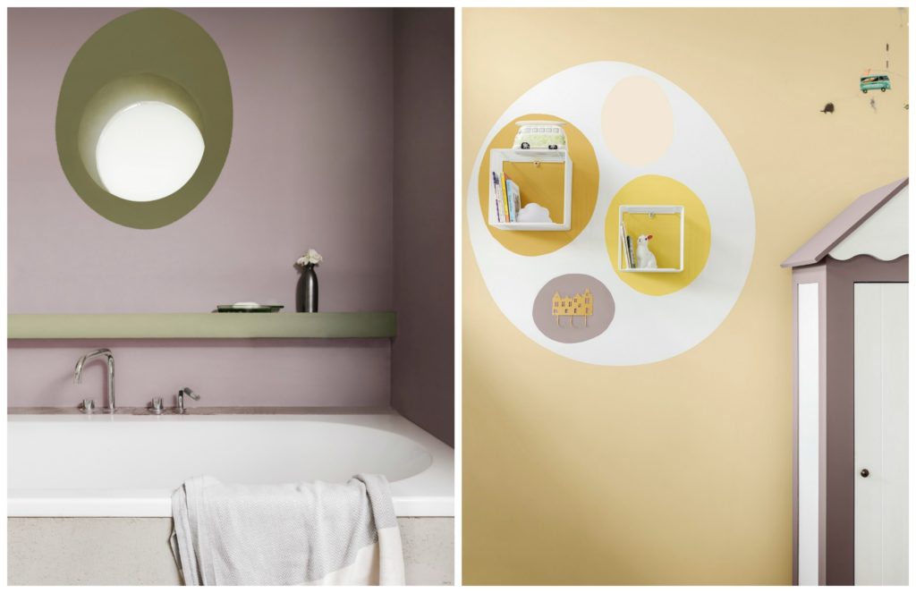
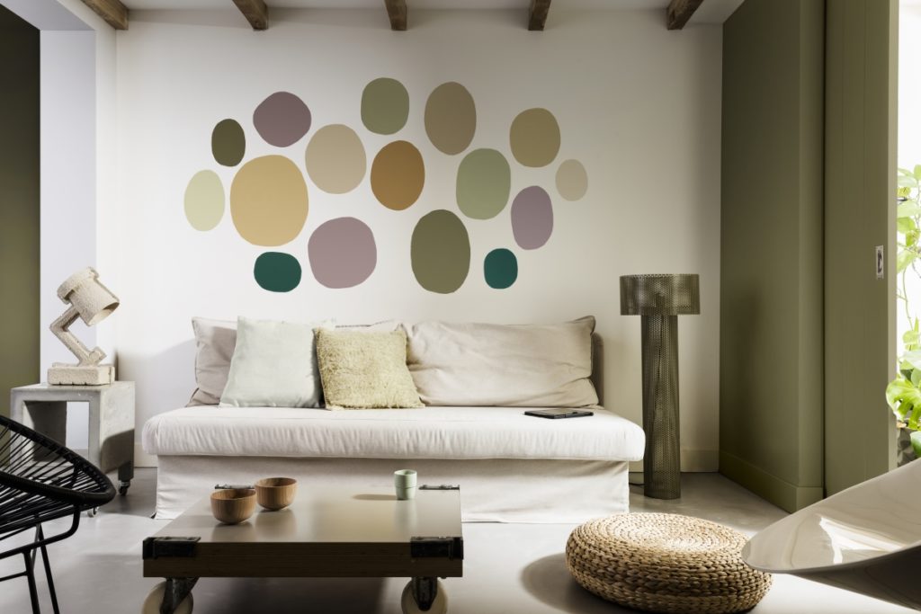
Naturally, a welcoming home does not mean the same thing to everyone & that’s why Dulux has created three palettes (personas) to complement Pictured Rocks as the hero shade. These different palettes can be used to create different types of welcoming homes. So whether you want a welcome home that is a retreat, provides comfort, is playful, is inviting or a space for shared quality time, look no further than these beautiful different palates.
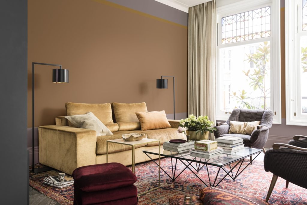
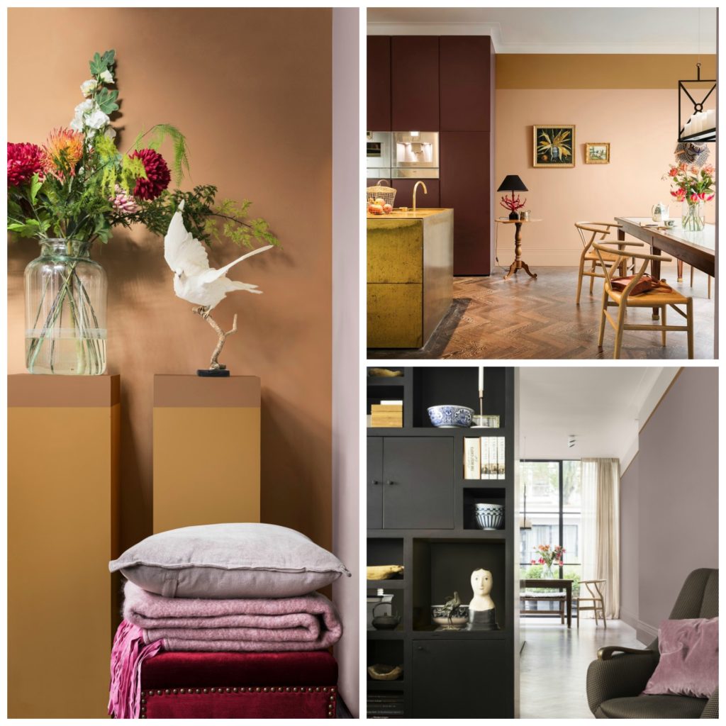
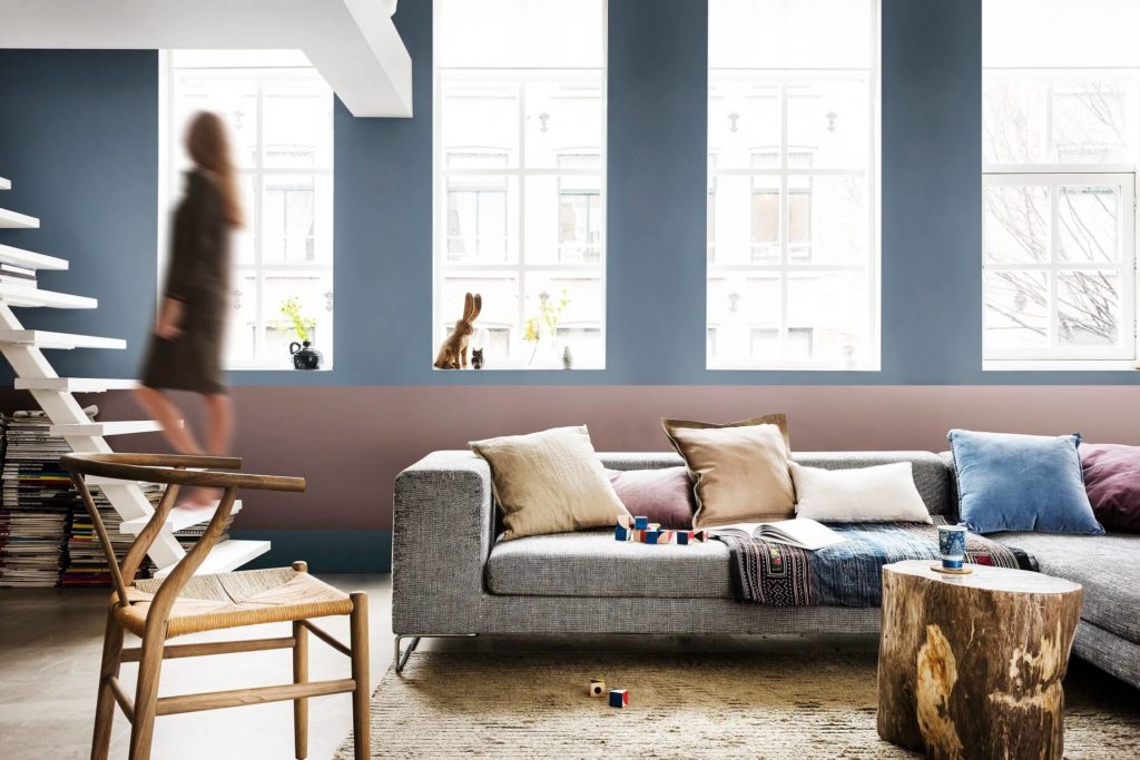
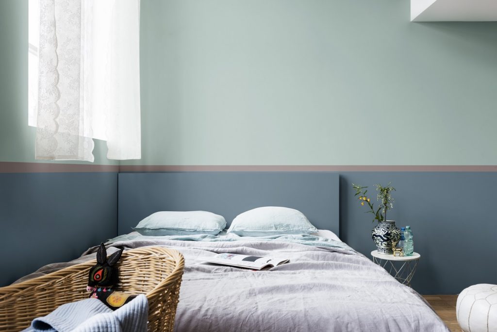
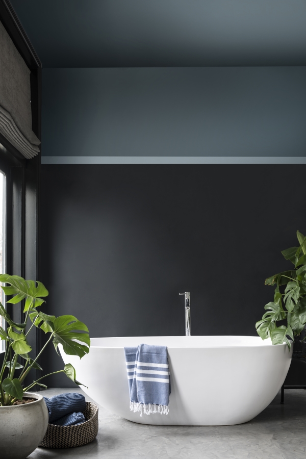
The Welcome Home Palette
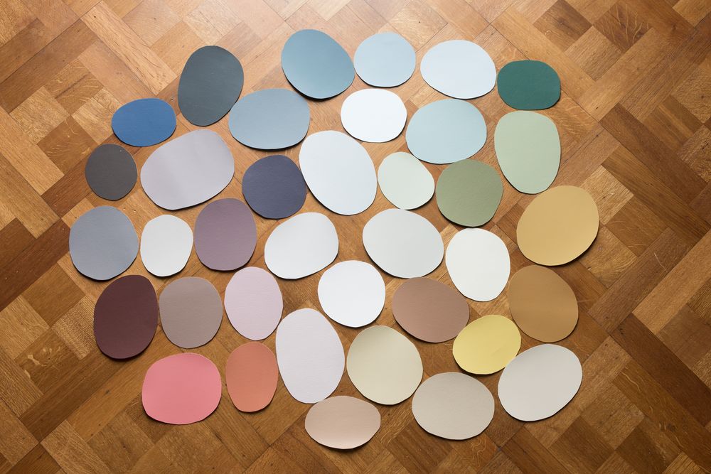
This overall palette combines gentle shades of grey-pink, blues & soft cocoa flowing into bolder shades of ink blue & purple. It takes inspiration from the tactile qualities of natural wood & the comfort of leather, materials that customers are known to turn to during times of unpredictability.
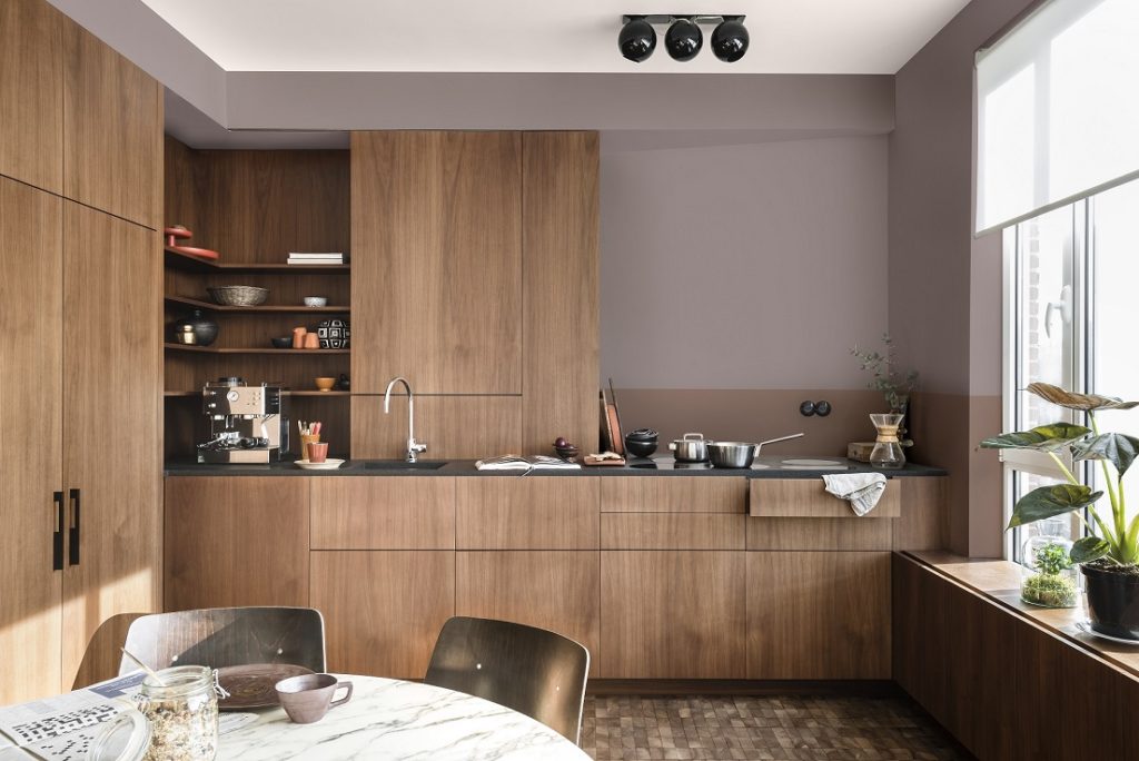
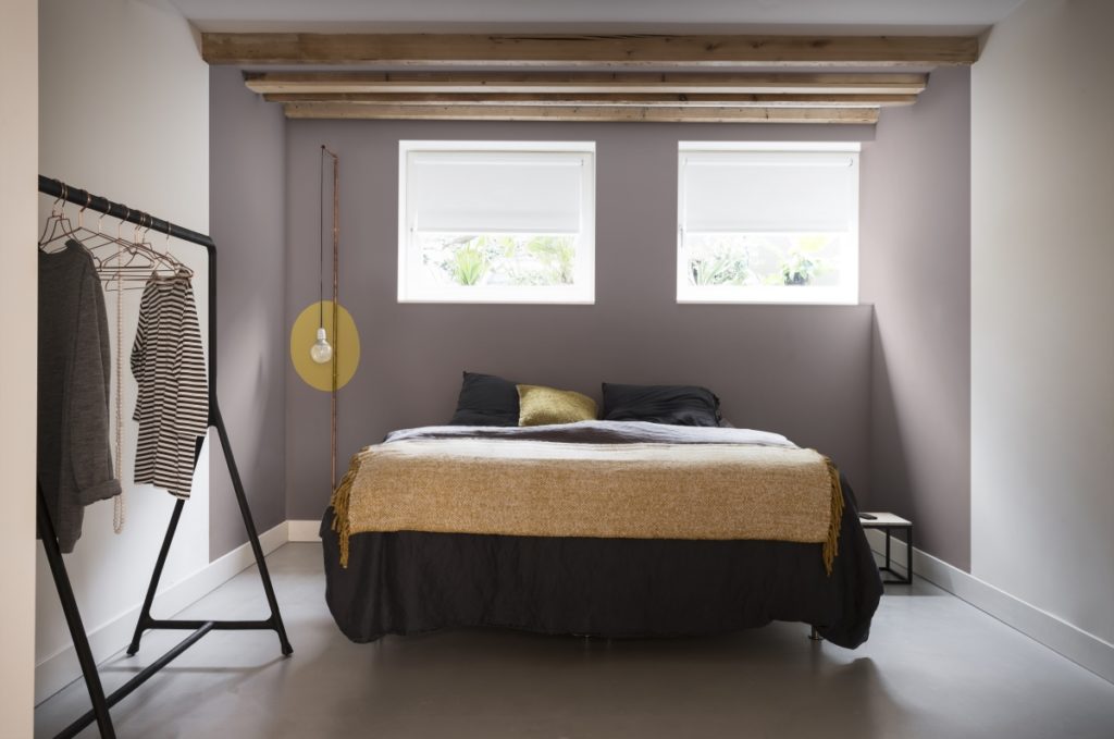
Palette #1: The Comforting Home
Welcome to the home of the warm-hearted; those who love quality & are thoughtful & grounded. The comforting home has a rich, welcoming interior & is a place where you can really recharge & reset your mind. A space to retreat into. A cocooning space to reset.
The palette to create this look includes warm earth tones that bring a sense of comfort, while clay & blush pink help calm the mind & rich terracotta.
Prepare to have your senses soothed with welcoming textures like silk & velvet; minimal technology & comforting hardwoods.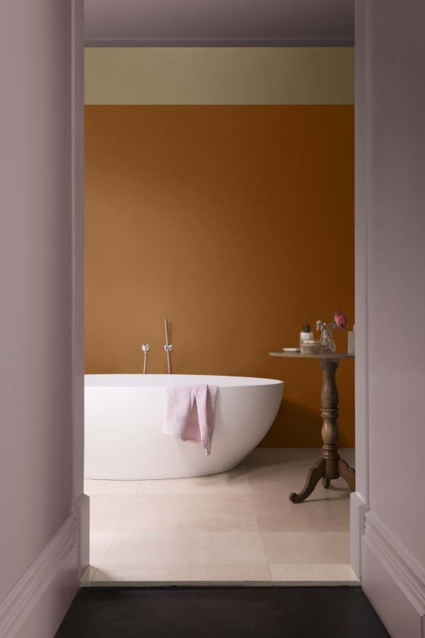
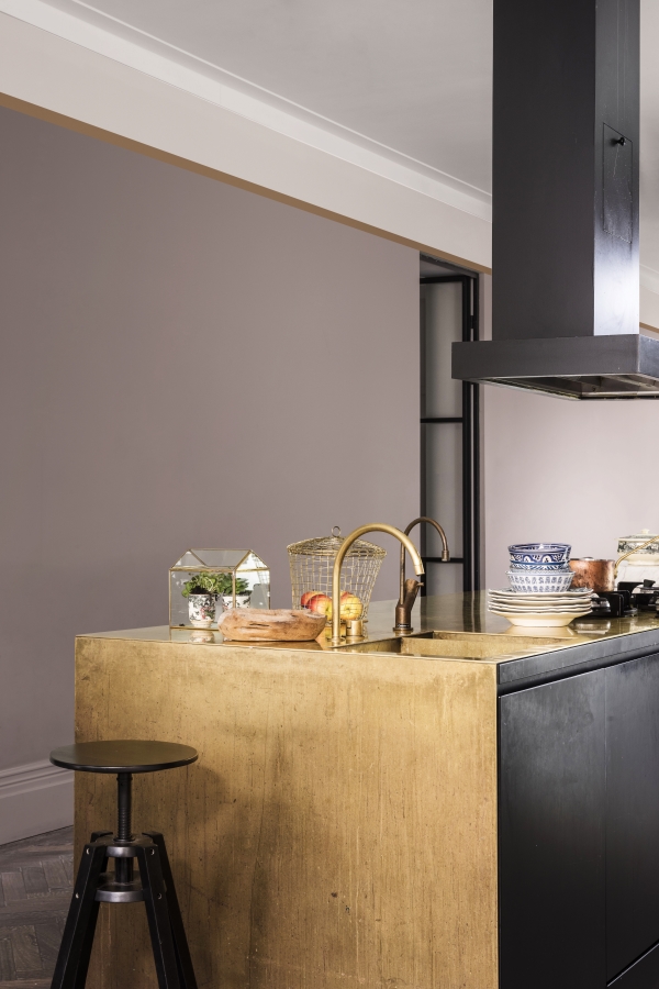
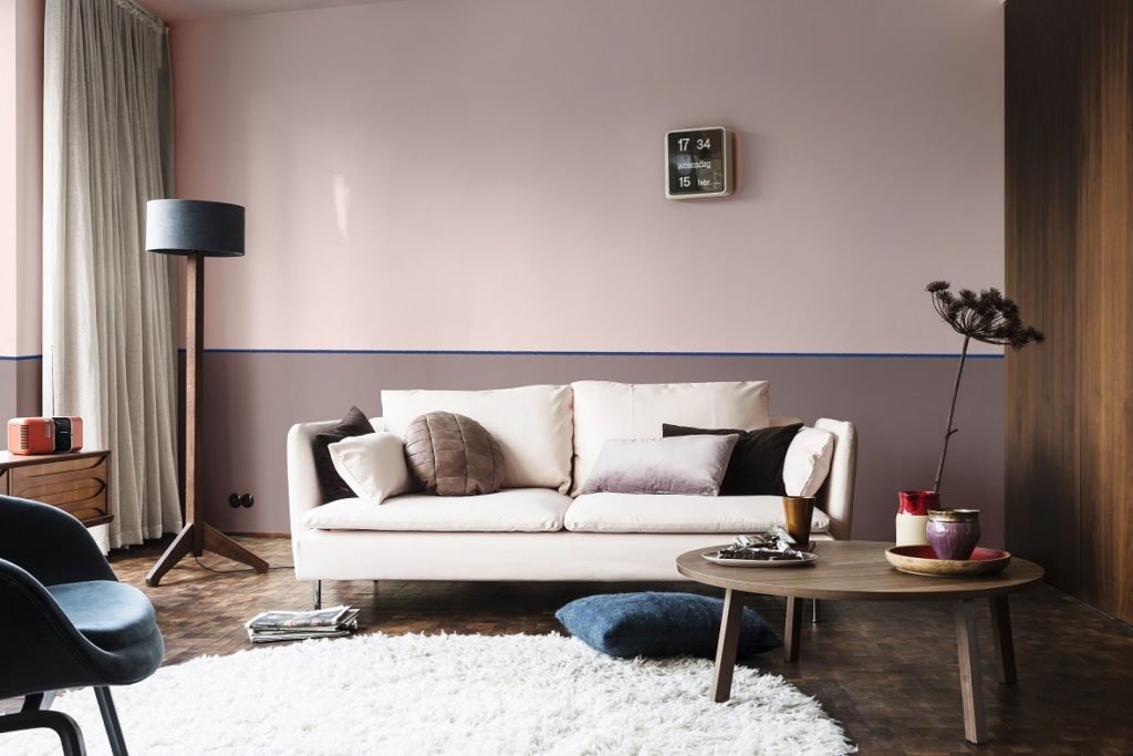
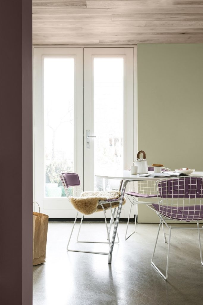
Palette #2: The Inviting Home
The second palette is for the open-hearted who need a space to collaborate & connect. Here, comfort & convenience come to life for those seeking to strengthen bonds & bring family & friends together.
Think easy going neutrals, cool shades of blue for a clear-headed approach to life, combined with fresh sea-green (for connection with the outside world). Softer pastel shades are enhanced by coal & ink blue.
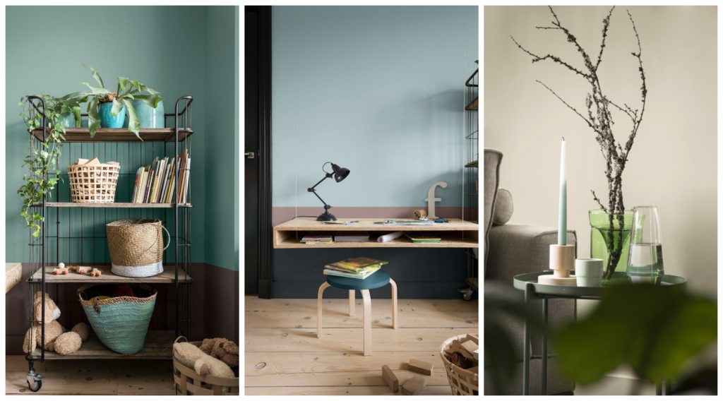
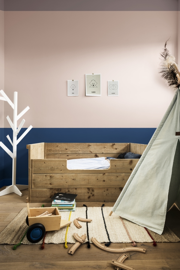
Palette #3: The Playful Home
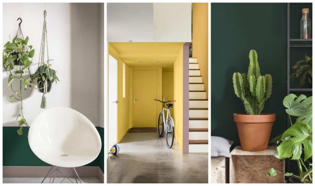
Vibrant pops of colour make the playful home inspiring & invigorating for the senses. If you are light-hearted & need a space to energize & inspire you, then this palette is for you.
Yellow-toned green & gold help spark the synapses & encourage a creative approach to life. Pops of colour add a sense of fun & energy. With clever use of colour, you can help create different zones within smaller spaces.
This is the abode of the curious, adventurous & adaptable. Early adopters of technology that is seamlessly integrated into their homes. They seek energy, experience & creativity, supplemented by the wealth of time they spend outdoors. Multi-functional, smaller spaces work with natural textures & fun patterns.
Pictured Rocks (also referred to as Nordic Sails 2 in stores & internationally) is available in leading paint stores right now.
I’d love to hear from you – are you in love with this colour of not quite? And which palette do you choose? My best is the inviting home.
Thank you for reading.
Yolandi ♥
Images:1st via The Pretty Blog by Christine Meintjes; Other images: supplied.
Love! Gorgeous colour(s)!
Influences of trends, colour forecast, fashion & style is a commercial approach of colour use, but unfortunately excludes personal relationship of the individuals colour requirements, neither does it recognize the complexity of colour development. Therefore, the cold facts that vision is a science and that fundamental societal understanding of colour science is important for the every-day experience of colour is ignored.
It is however, an excellent colour palette for designers who are unsure of their use of colour needs design, and play it safe on an objective approach and creating show-house colour spaces you stay in rather than live in.