Somehow for about seven years, our room did not receive much attention. It was always liveable, but rather sad looking. Sad pedestals, no headboard…
Needless to say that when we moved into our (first grown-up) home in April 2015, I wanted to give our room some special attention. The ‘shell’ was lovely to start off with – a huge walk-in closet, en-suite bathroom & a mountain view, but it had to be personalised.
And today I’d like to share the first before & afters of our (grown up) home. This is not a very drastic make-over, but I’m still pleased with the outcome.
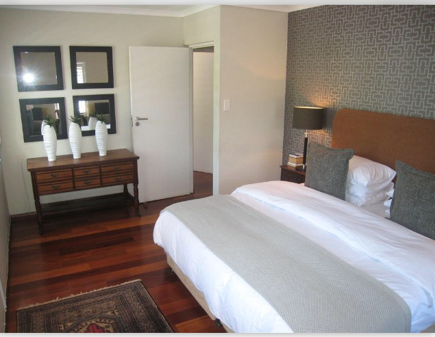
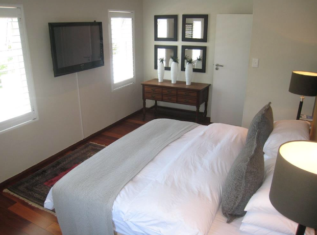
Our room: the ‘before’
The previous owners were great at decorating, except that their style was absolutely & totally not our taste! One very specific item that I strongly disliked, was the wallpaper in our room… (Turns out my other half liked it, but I couldn’t see myself sleeping beneath this ‘Tetris’ wall for very long.’). I was also not applied very well, so it simply had to go.
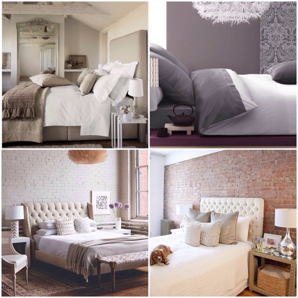
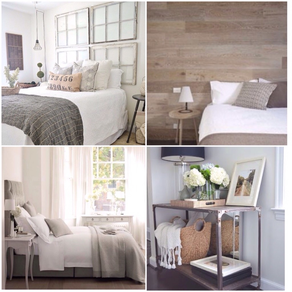
The Inspiration
These lovely pics from Pinterest & some ‘key descriptive words’ were the inspiration for the room: clean lines, uncluttered & romantic.
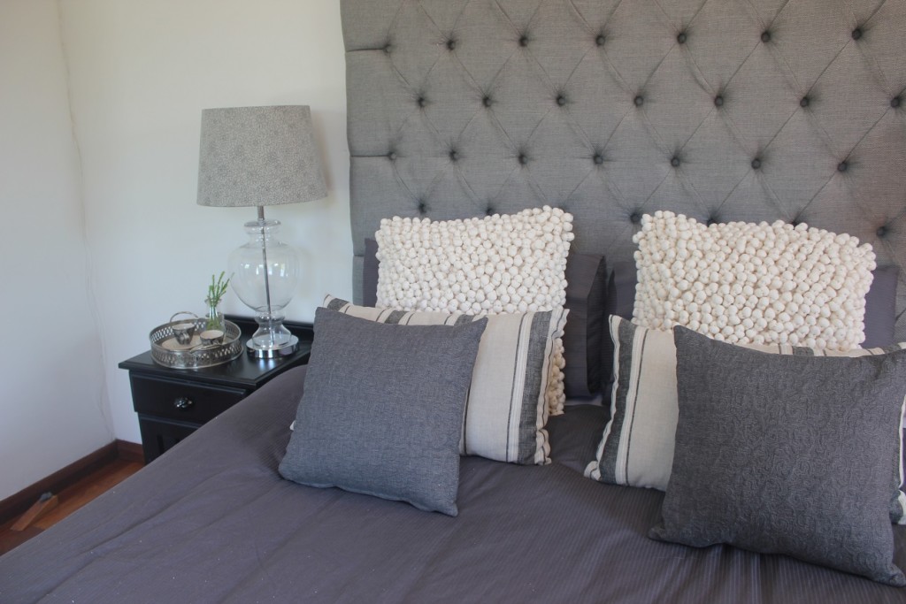
We still love the exposed brick wall behind the bed, but sadly that will have to wait. A deep buttoned headboard was one of the key items I used to give this room a pick-up.
The ‘After’:
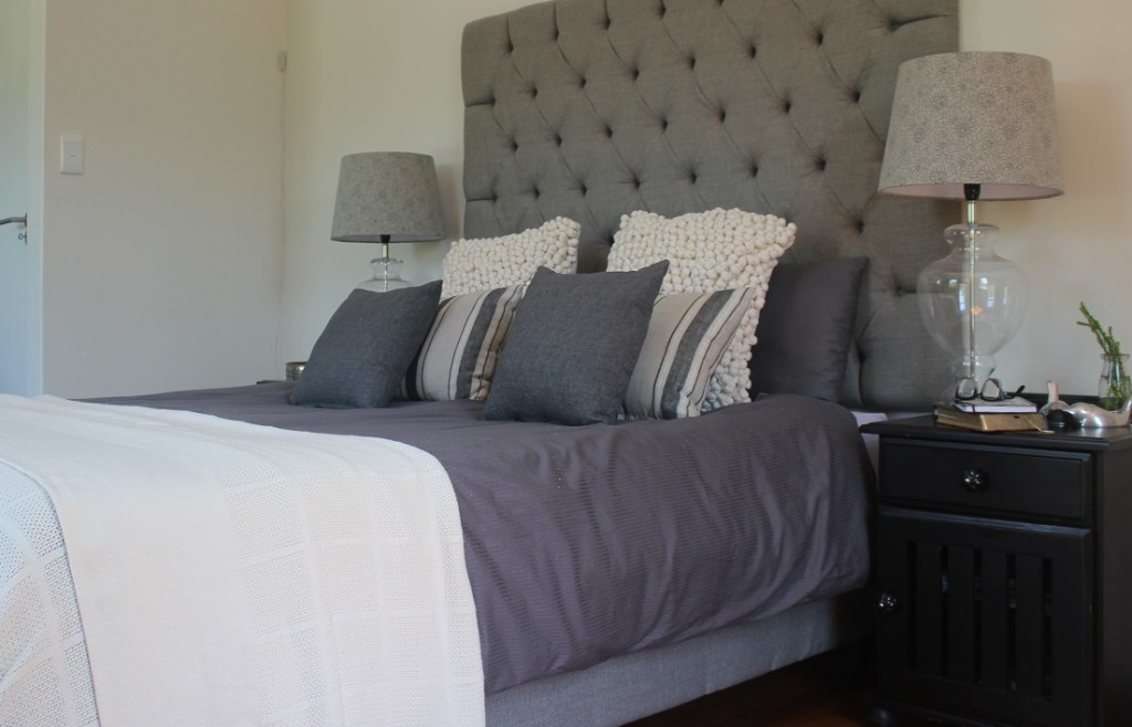
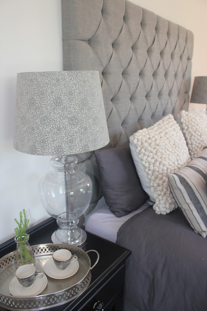
The wallpaper was removed & the wall behind the bed got a fresh coat of paint to match the rest of the room. The extra height deep-buttoned headboard was custom-made & installed.
I also had the base of the bed reupholstered in the same fabric as the headboard, to eliminate the need for a night frill. I absolutely love this look!
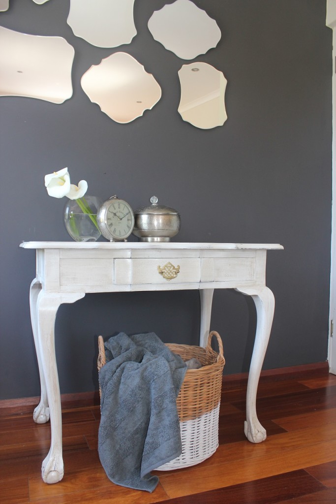
I sent the little silver ball & claw table (that we inherited) for a facelift. It went from very sad looking chipped-off silver to ‘french antique’ – the work of uber passionate Cecil at Woods Alive.
We absolutely love a bed with crisp white linen (which is also what we’ve had for the last seven years), but this time around I opted for some dark grey linen instead. I just figured that it is probably a bit easier to keep a darker colour scheme looking fresh when you have a two-year-old in the house.
Thanx for letting me share a bit of our space with you. Watch this space for more peeks inside our home.
Yolandi ♥
Pinterest reference image credits: 1, 2, 3, 4, 5, 6, 7, 8
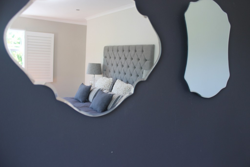
Scatter cushions, base & head board/custom by Robin’s Nest from Whatnot & Mavromac fabrics; Side table knobs/Builders’s Warehouse; Antique mirrors/@Home, Mr Price Home; Bed lamp bases/Mr Price Home; Towels & summer blanket/Volpes at Coricraft

Love it!
Thank you. xxx