
Every year, the trend spotting colour specialists at AkzoNobel – manufactures of Dulux – identify one hero paint colour that perfectly encapsulates & expresses our collective living spaces.
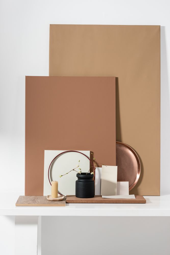
With Crème Brulee being one of my all-time favourite desserts, I was delighted when Dulux recently revealed their Colour of 2019 as… CREME BRULEE – described as “a purposeful & delicious amber tone that will gently awaken all the senses”.
So, how do they decide on the colour of the year you may wonder? Other than the fact that Creme Brulee is of so yummy? The annual choice is based on loads of research into societal, cultural, design & lifestyle trends from various disciplines & lifestyles. As they gain insights, they can predict what is going to be important to consumers in the coming year. So, essentially trends are translated into colour.
You might remember that the (current) 2018 shade (Pictured Rocks) was all about retreating to the safety of your home. The pause & rest that we supposedly got has now made way for positivity, purpose & transformation & voila, Creme Brulee is served.
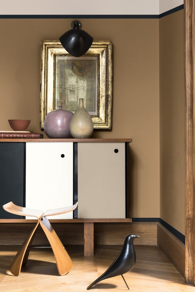
“Creme Brulee is inspired by the varied tones & remarkable properties of honey – natural, timeless & enduring, protective, rejuvenating & healing,” says Nathalie Sweeney, Decorative Paints Marketing Director of Sub Sahara Africa for AkzoNobel. Incidentally, the colour is called Spiced Honey abroad.
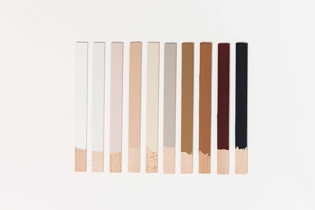
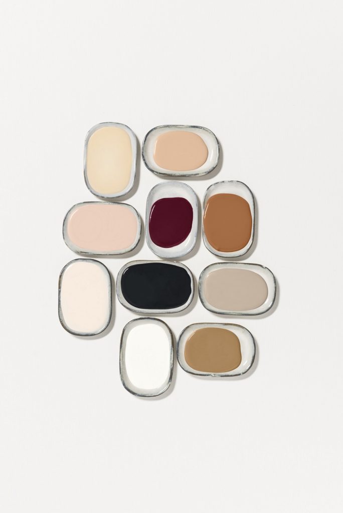
Along with the colour of the year Dulux also developed & included several themed matching palettes in the celebrated ColourFutures™ forecast. These will be rolled out as 2018 progresses.
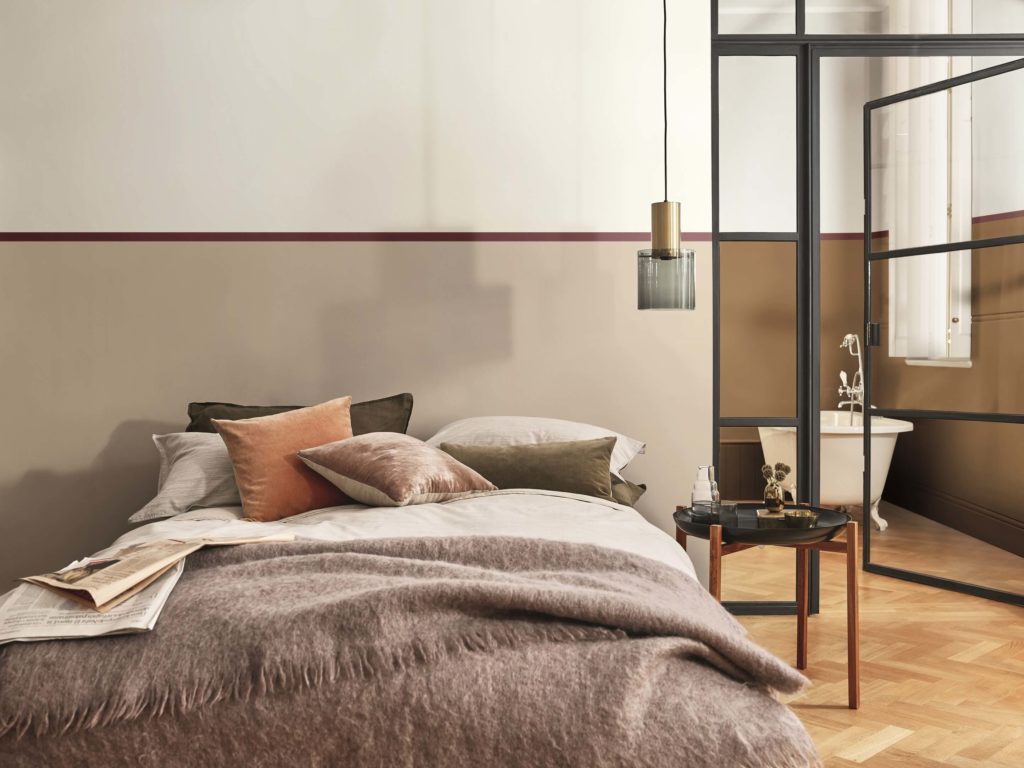
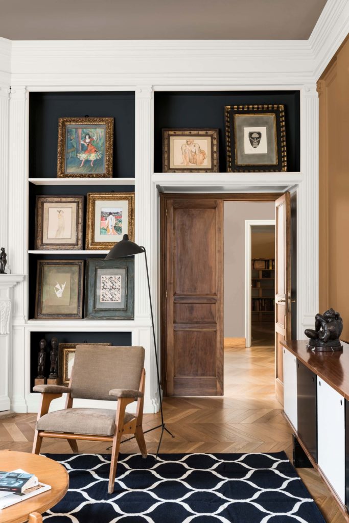
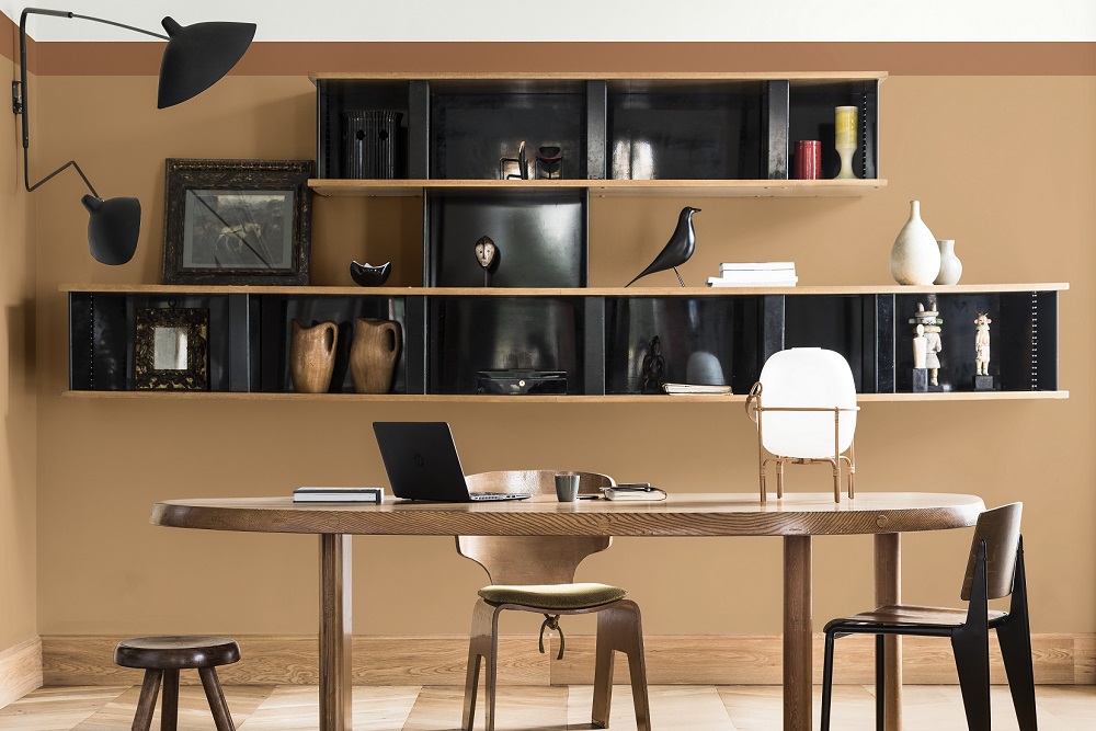
Says local interior designer Megan Hesse of Hesse Kleinloog: “The palettes inspire a sense of awakening. Moments of resilience, kindness, sophistication & optimism are created. It is a palette within trends that encourage comfort & thought.” Megan also loves the versatility of the colour as it fits equally well into high-end spaces & simple interiors alike. It is subtly powerful & ideal for creating the so called Hotel Chic look.
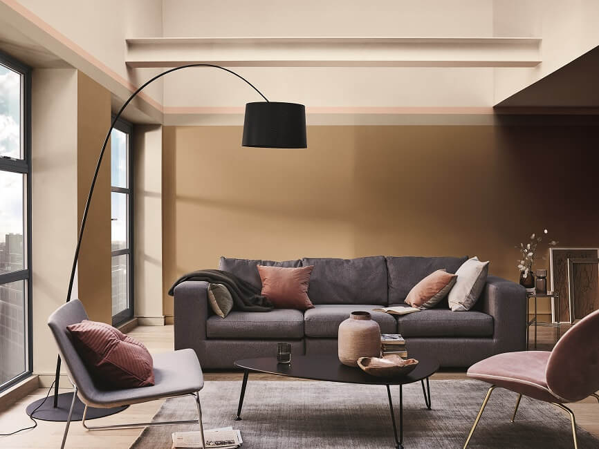
According to the ColourFutures™ Report, 2019 is set to be a year of optimistic consciousness & so the bright theme of ‘Let the Light in’ runs across the colour palettes. Creme Brulee’s warm amber tone perfectly captures the ‘Let the Light in’ theme which can be either calming & nourishing or more stimulating & energizing, depending on the light & colours surrounding it. Truly versatile & contemporary, Creme Brulee is the ideal choice for reflecting our new sense of positivity.
Creme Brulee is warm yet relaxed but still drives purpose. Think positivity & stimulation – exactly what the world needs right now.
The Akzonobel trend research shows that people around the world are experiencing a renewed sense of energy, optimism & purpose & the power to ‘be the change’. We’re figuring out what matters to us most. Sweeney agrees: “There’s a desire to reach out, engage with others, & to make things better. That change can be anything from marching for women’s rights & fishing plastic out of the ocean to small acts of neighbourly kindness. People are ready to seize the moment.”
“There’s a growing feeling that we can’t let others do the thinking for us anymore, we need to come up with our own solutions… There’s a growing desire to create homes where we can contemplate, consider, gain perspective & forge our own conclusions about what really matters to us. Now, more than ever, we need the time & the space to think,” says Sweeney.
What do you think? Are you sold on Creme Brulee (the colour)? I think I might just be falling in love with this palette. I have only one big concern with this colour which is that I will be craving Creme Brulee for the entire 2019…
Thanx for reading.
Yolandi ♥
I looooooove this colour!
🙂 xxx