
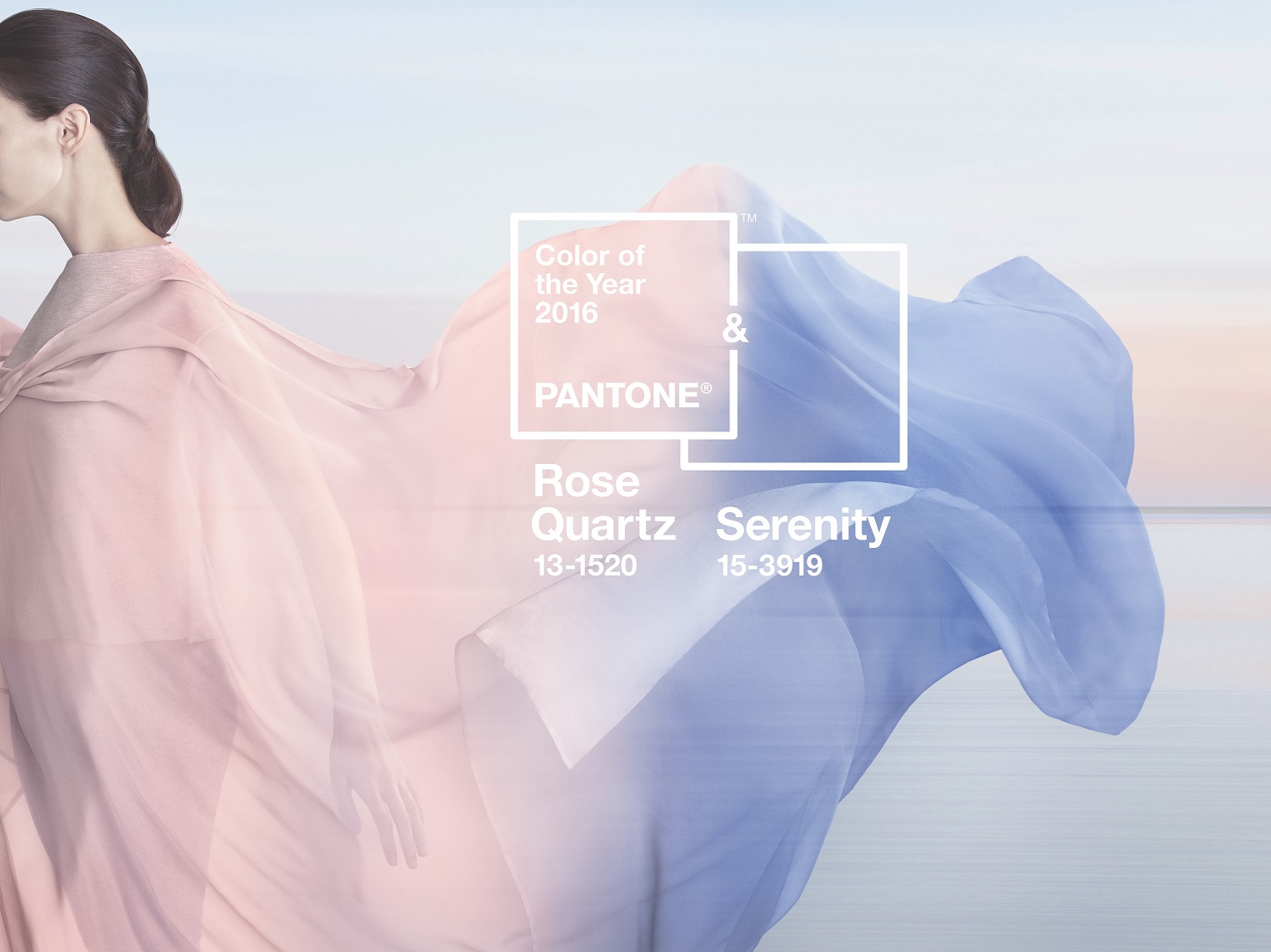
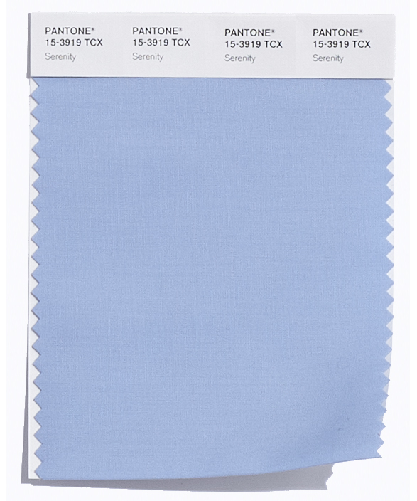
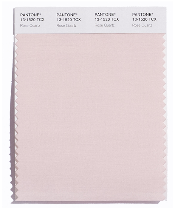
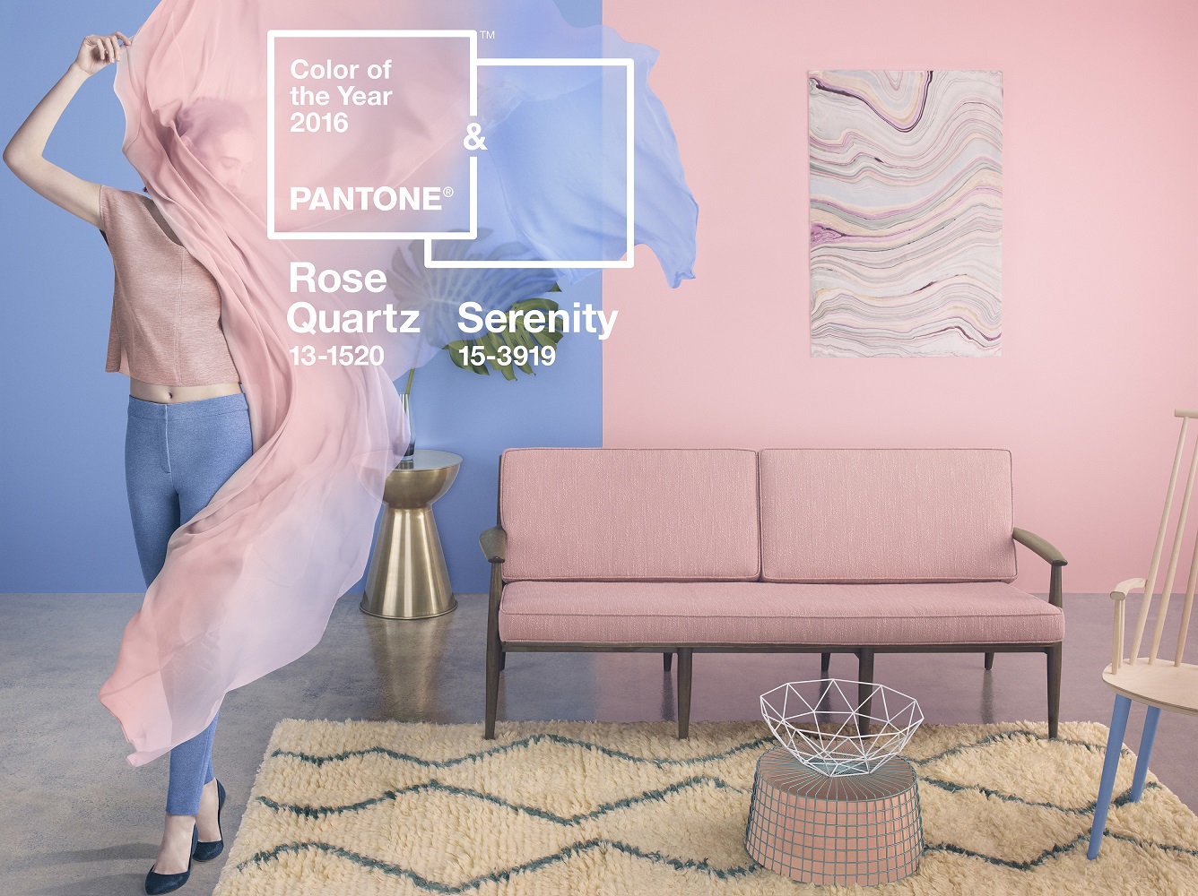
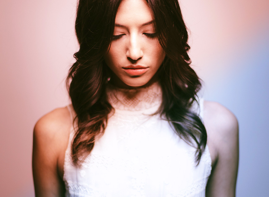
Pantone, the colour authority worldwide never ceases to amaze. Just like last year with Marsala – the deep wine red – they had a surprise (make that two) for us when the new colour was announced early in December 2015. Yes, for 2016 Pantone named two colours of the year: Serenity & Rose Quartz.
WHAT DOES THIS SOFTER TAKE ON COLOUR MEAN?
During the (December 2015) webinar Pantone explained that the popularity of a colour is a sign of the times in which we live. The world is faced with political turmoil, spiritual & economic instability, drama. The list goes on & on which is why people yearn for equilibrium, well-being & inner peace. These two shades exactly that; a balanced, attuned mind set, explained Leatrice Eiseman, Executive Director of the Pantone Color Institute™. “With the whole greater than its individual parts, joined together Serenity & Rose Quartz demonstrate an inherent balance between a warmer embracing rose tone & the cooler tranquil blue, reflecting connection & wellness as well as a soothing sense of order & peace.”
The combination further symbolises the rebelling against stereotyping & focusses more on the continuing agender / gender neutral trend. Blue is no longer just a boy colour & light pink no longer just for ballerinas. Both colours are for everyone. And let’s hope that by incorporating these two colours in your life, you will also be inspired to live a more mindful life. Here’s how:
FOR YOUR HOME
Personally, I believe that the easiest way to play with this colour combo is by using fresh flowers or use your tea or breakfast table as your canvas. Stick to smaller (replaceable) items if you are wary of bold colour statements. Use it to create a sense of balance & harmony, Think wellness, comfort & calm.
Liza Watermeyer, retail & exhibitions coordinator of Tile Africa has some more tips on using these colours in the home:
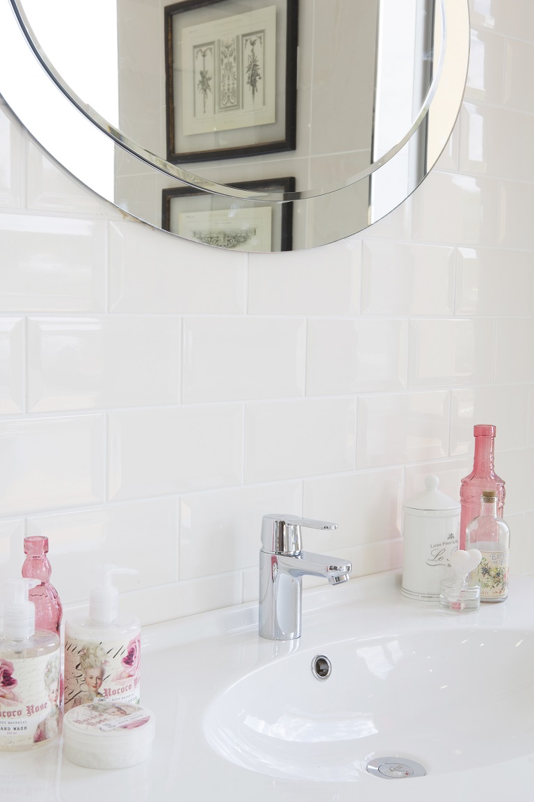
In the bathroom – Accessorize with towels, a bathroom mat, soaps & candles. Add a freestanding table or wall mounted shelf to hold all the bathing essentials, paint in a lighter tone. Finish with a potted plant in a container that mimics the original hue.
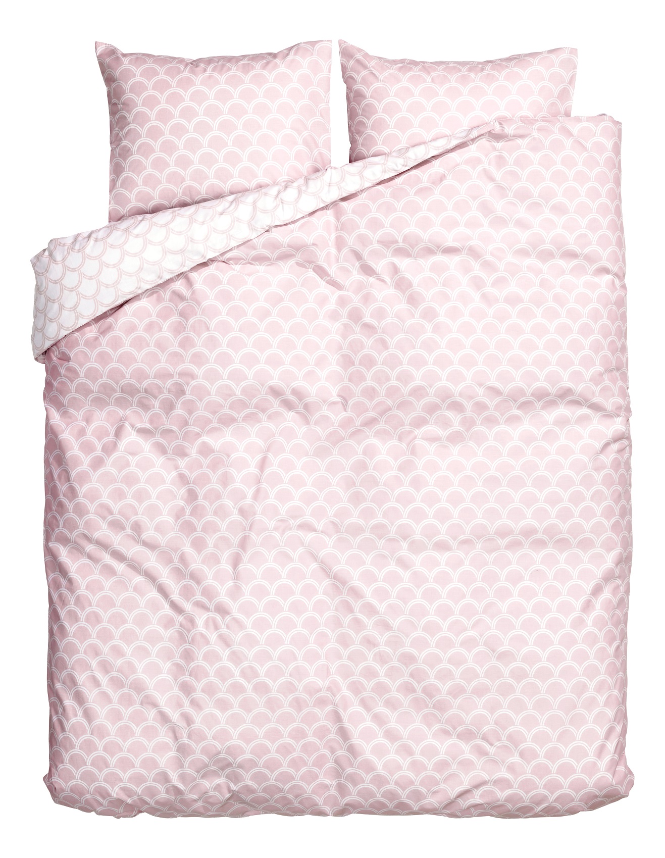
In the bedroom – Add a soft, dreamy throw at the end of the bed. Trim neutral curtains in a matching hue & coordinate with an upholstered daybed or chaise in an analogous shade. Silk, linen & mohair look especially good in these gentle, relaxing tones.
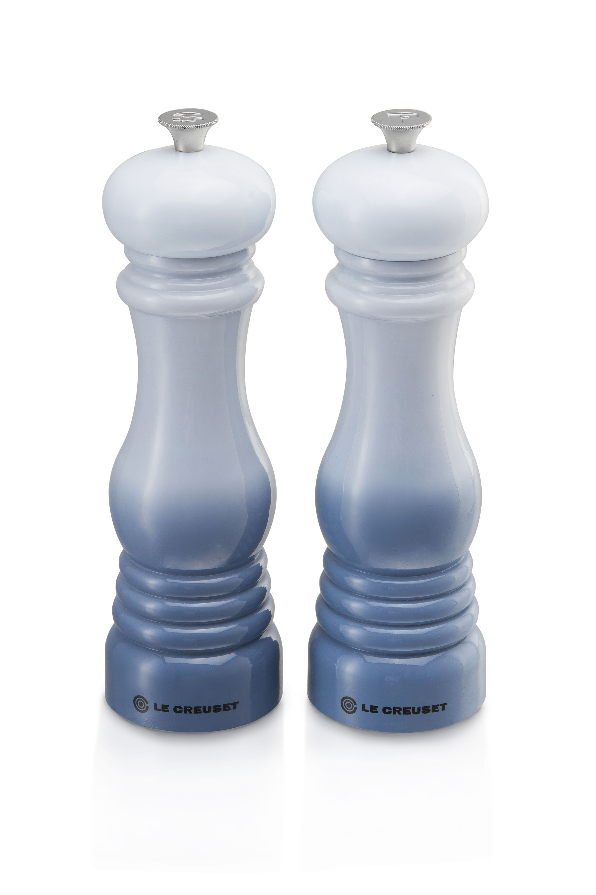
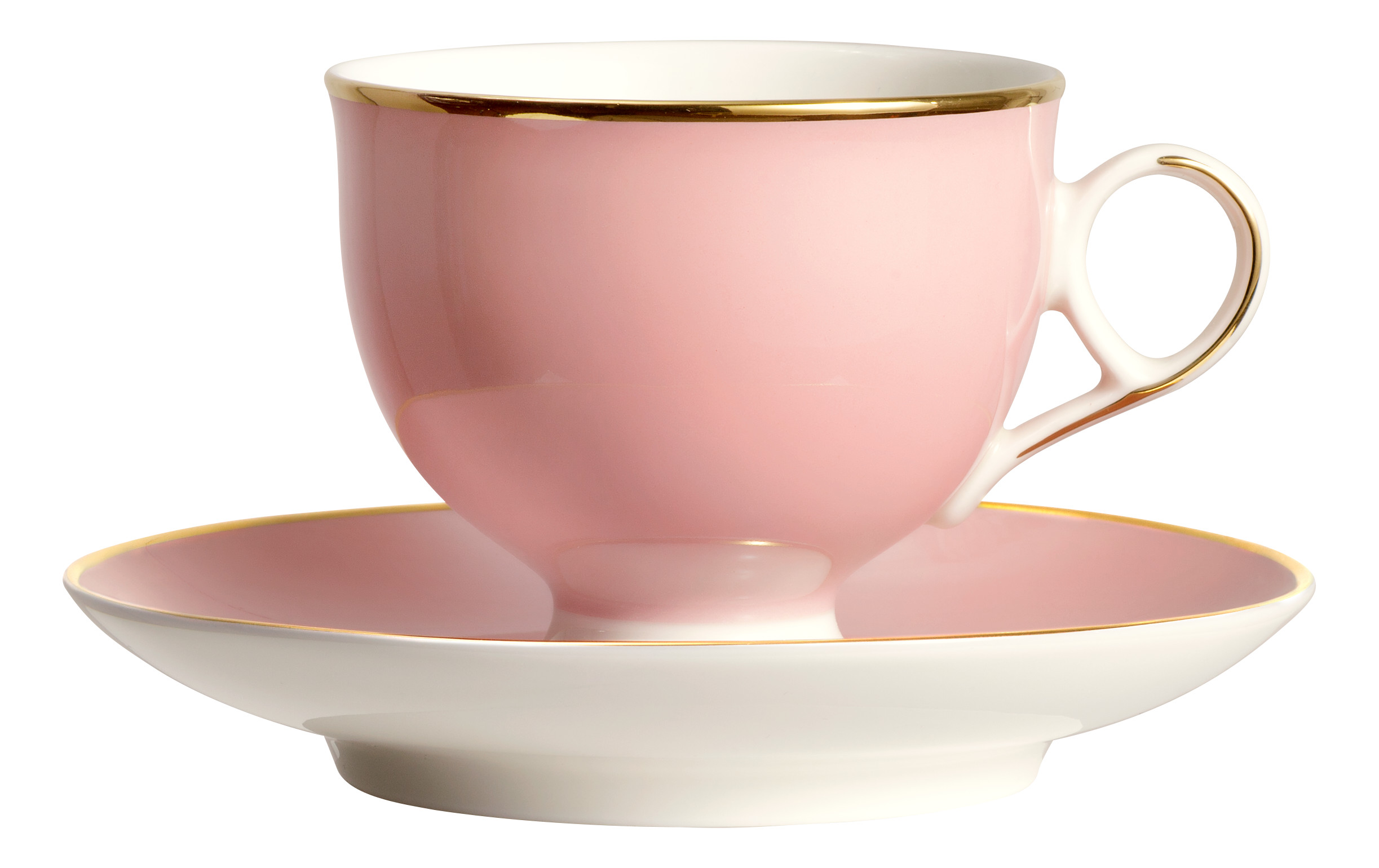
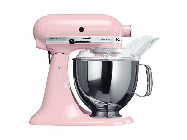
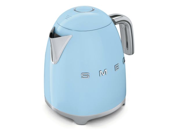
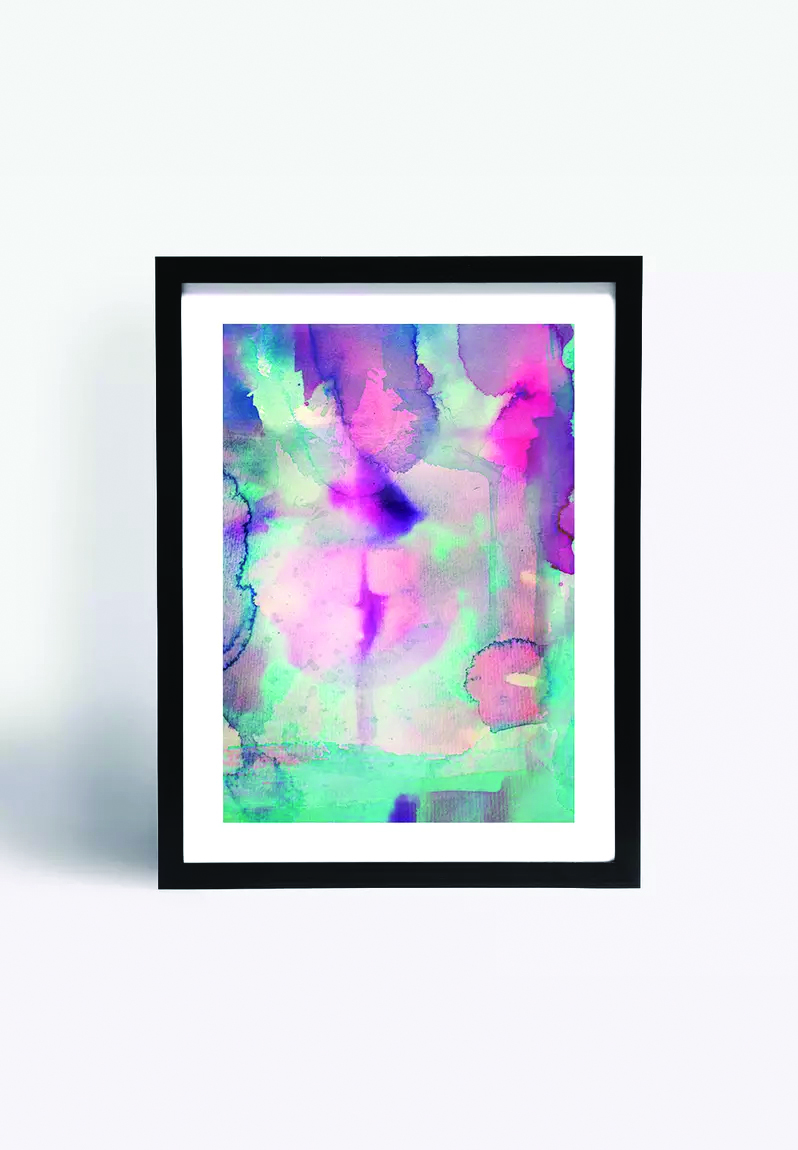
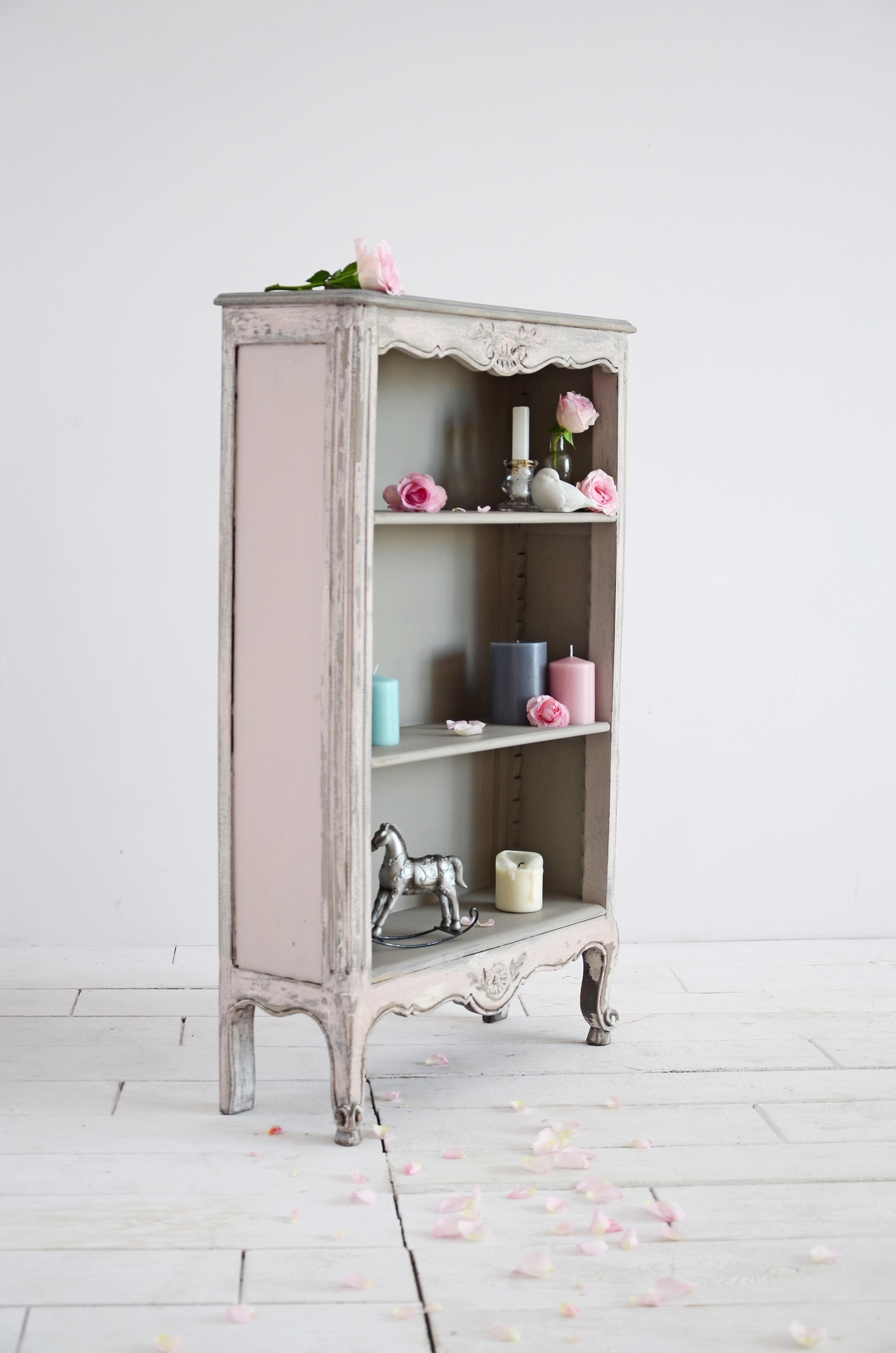
In the kitchen & living areas – Many appliances come in these engaging colours. Add matching crockery on open shelves in the kitchen. Use frames in these hues for black & white etchings or sketches, on a white wall. Combine texture, light wood / metal furniture in a matt patina & use any one of these colours for selected objects, occasional chairs & artwork.
“The 2016 Pantone colours are soft & harmonious…[but] I personally would team these colours with something strong, like a bright orange, to create a modern-retro 1960’s look,” adds Annie Sloan, international paint expert.
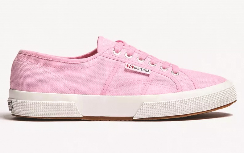
FOR YOUR WARDROBE
“These colours will look lovely in this season’s cotton shirts, floral prints & flowing silhouettes,” explains Candy Booysen, Marketing Manager of Poetry. “The balance between warm Rose Quartz & cool Serenity is perfect for the transitional season of autumn. The soft tones compliment a medium or olive skin tone, as well as dark features.”
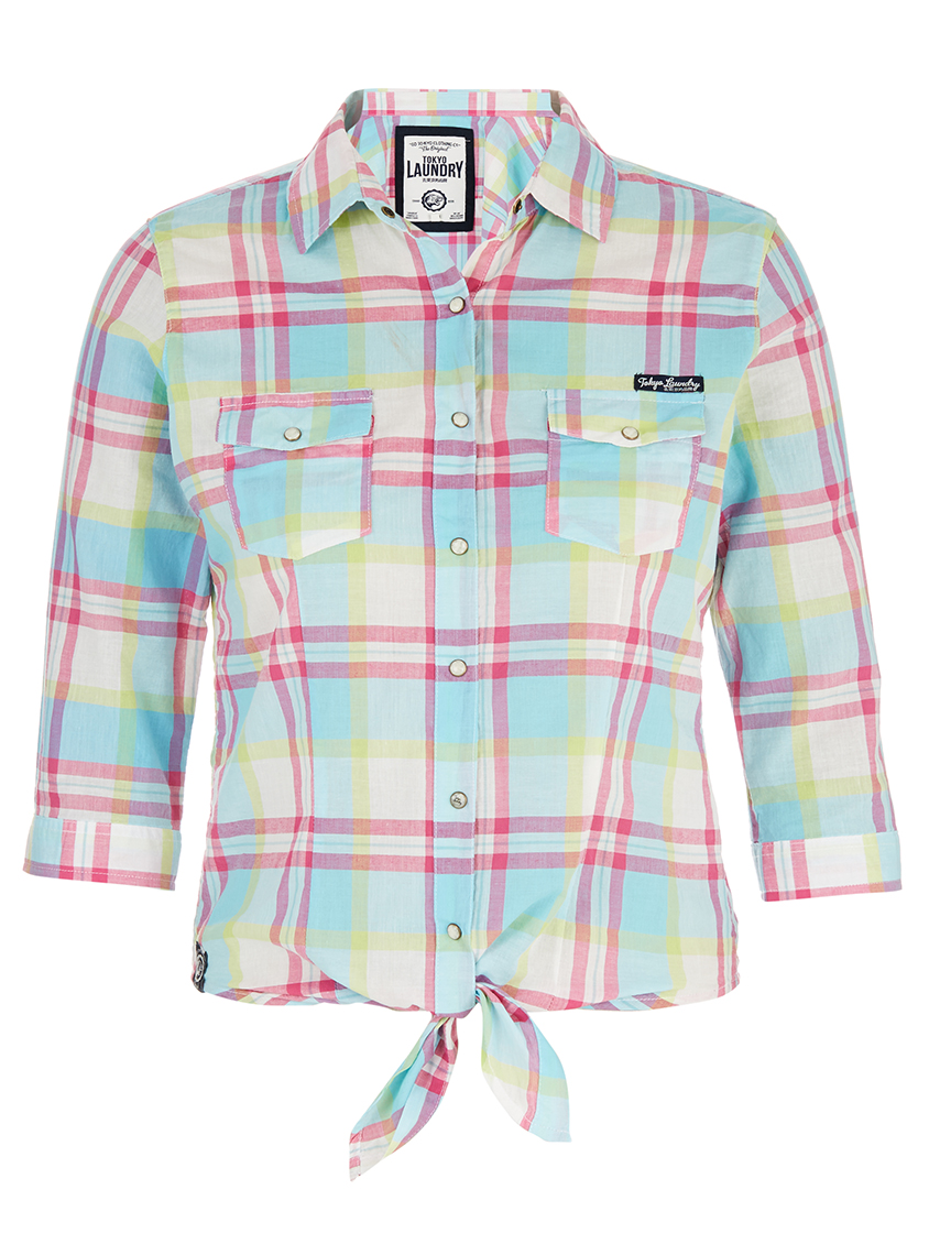
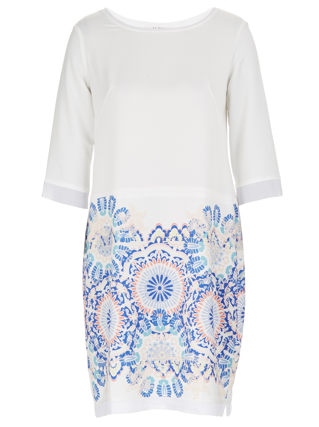
If you are unsure about whether these colours suit you, incorporate them into your outfit with a pair of shoes or a scarf. Accessories are the ideal way to wear these colours without looking dull or washed out.
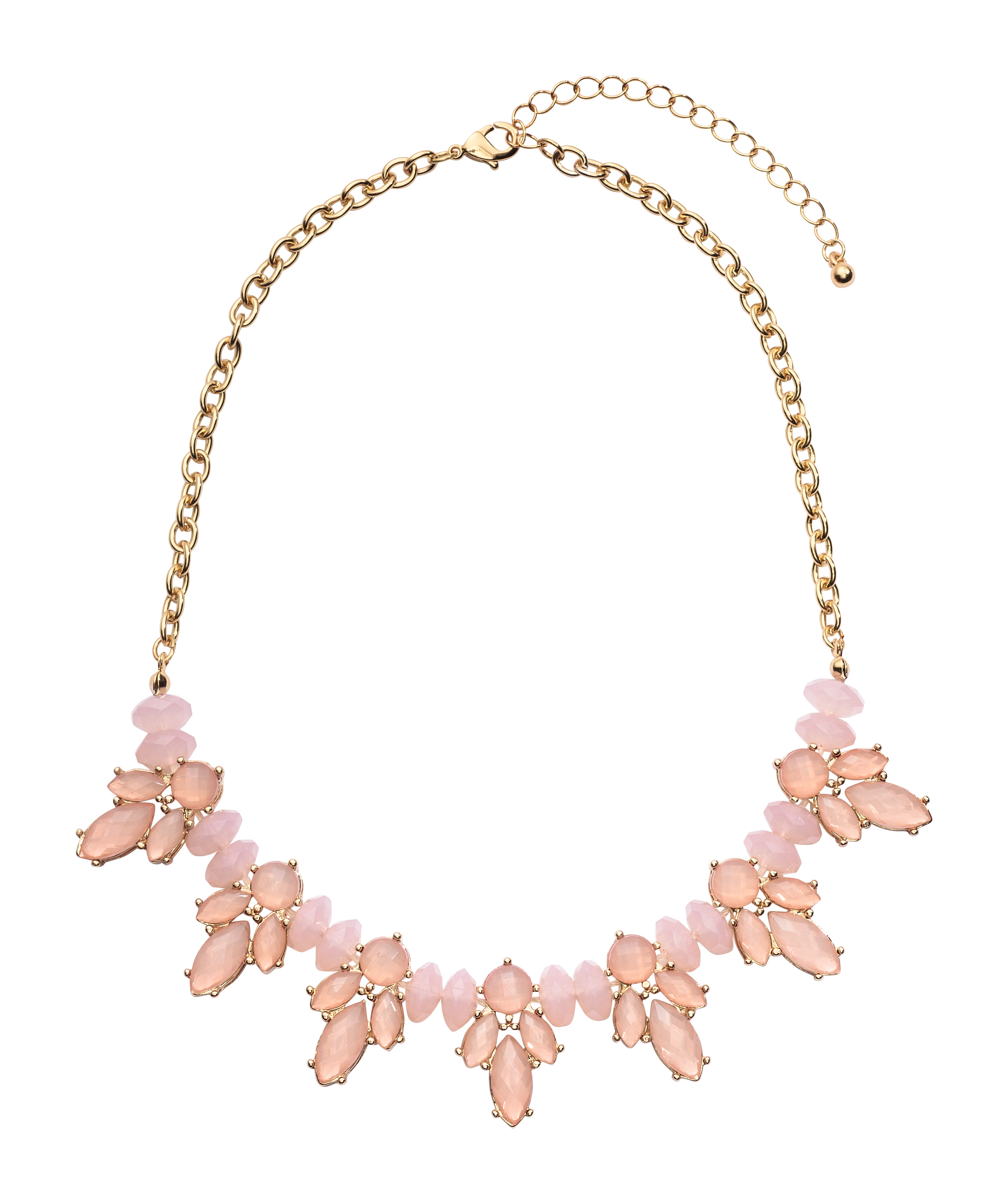
“Soft green, light grey & rich browns compliment the calm colours of this year’s Pantone winners & pairing them with silver jewellery will add a little sparkle to your ensemble.”
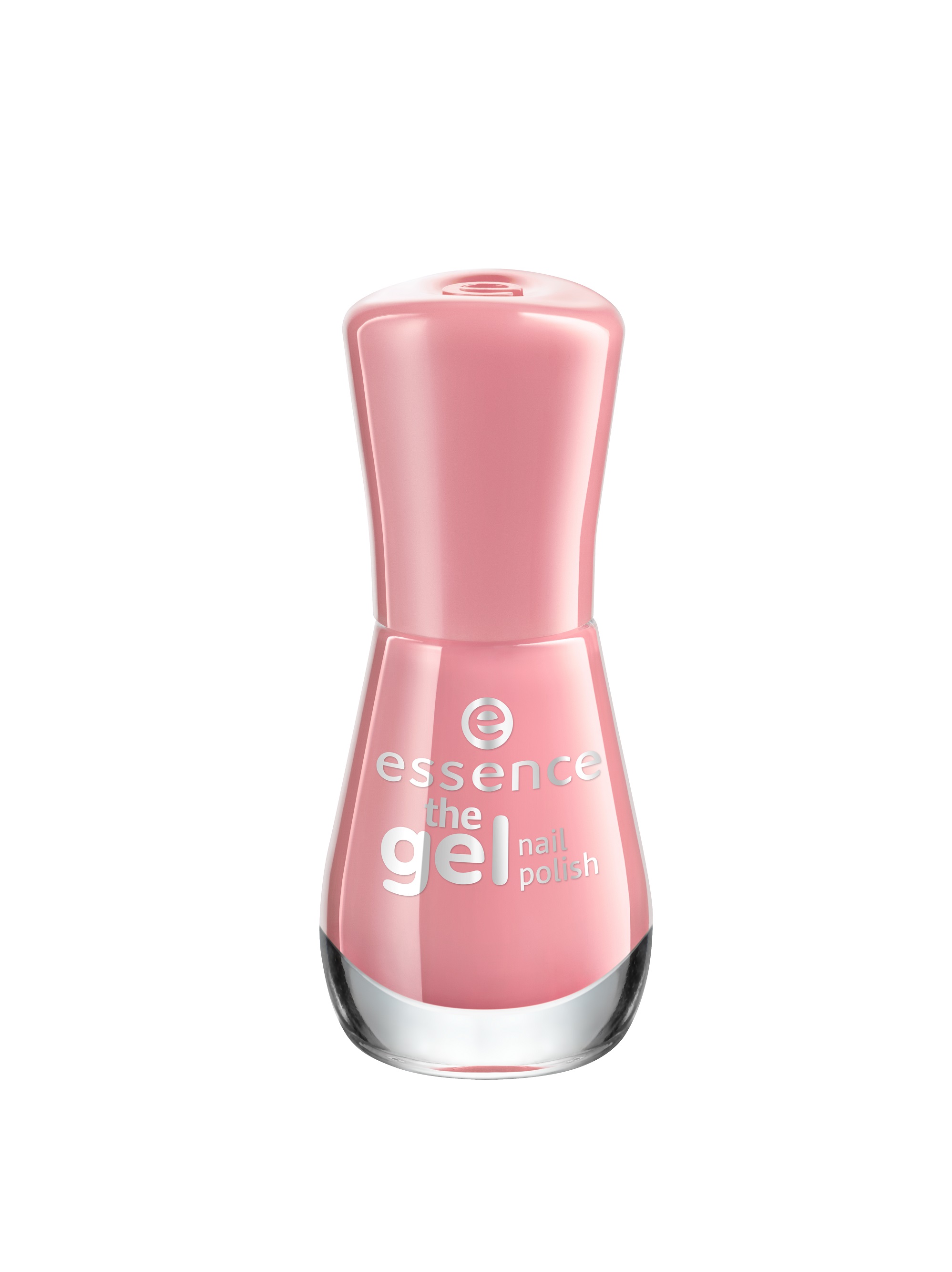
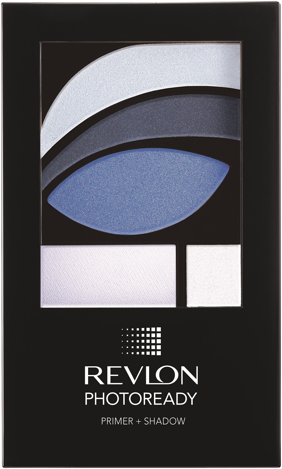
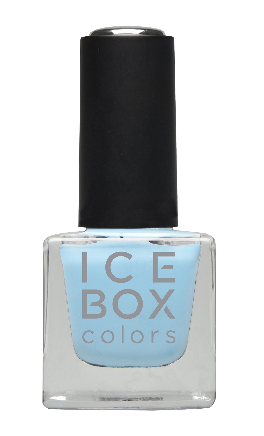
BEAUTIFUL HUES FOR YOUR MAKE-UP BAG
“A foolproof way to use bold shadow: pair it with black eyeliner & mascara & keep the rest of the face neutral with soft blush & nude lips.” explains celeb make-up guru Bobbi Brown in her book Everything Eyes.
Beauty Advisor & Training Manager at Revlon, Hildegard Spieker, also kindly offered her tips on how to incorporate these colours in your make-up regime:
- Use Serenity in the crease of your eyelid & create a v-shape in the outer corner of the eye
- Use Rose Quartz on the lid & the inner corner of the eye for a highlighter effect
- You can also combine these two shades with a wet brush & use it as an eyeliner
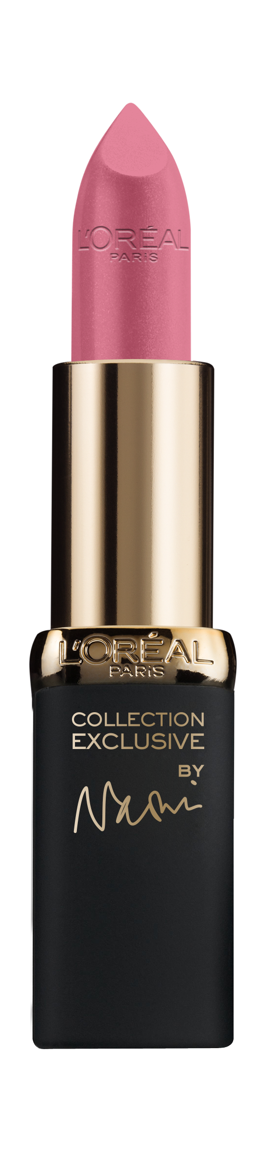
- Rose Quartz can also be used on the lips for a more natural look
- For the cheeks, you can use a bronzer to contour & use the pink on top to enhance your cheekbones
There you have it – the baby hues of 2016!
Yolandi ♥
Ps. Wondering how the Pantone Color of the Year is selected each year? The process is very thoughtful & a lot of consideration is given to the choices. To arrive at the selection each year, the experts at the Pantone Color Institute comb the world looking for new colour influences. This can include all industries (including fashion & entertainment).
I love these two colors (especially together) I love the idea of bringing them through with colorful appliances!
Totally agree, Laura. The SMEG goodies in these colours are to die for. xxx